Official FAT Recap - Day 3 SS24
- Jul 1, 2024
- 20 min read
The third day of Fashion Art Toronto’s 1664 Fashion Week SS24 ran the gamut of artistic expression, with designers representing all facets of the industry executing powerful presentations. Held at Black Creek Assembly, the shows began earlier than previous days - no longer constrained by the obligations of their day jobs, guests were excited to spend their day onsite. From overt political statements to colourful collections dripping with positive vibes, the whole of Toronto fashion was certainly on display.

The runway room of Fashion Art Toronto's 1664 Fashion Week, SS24.
Photo by Eliza Khalemendyk.
HAILMARY
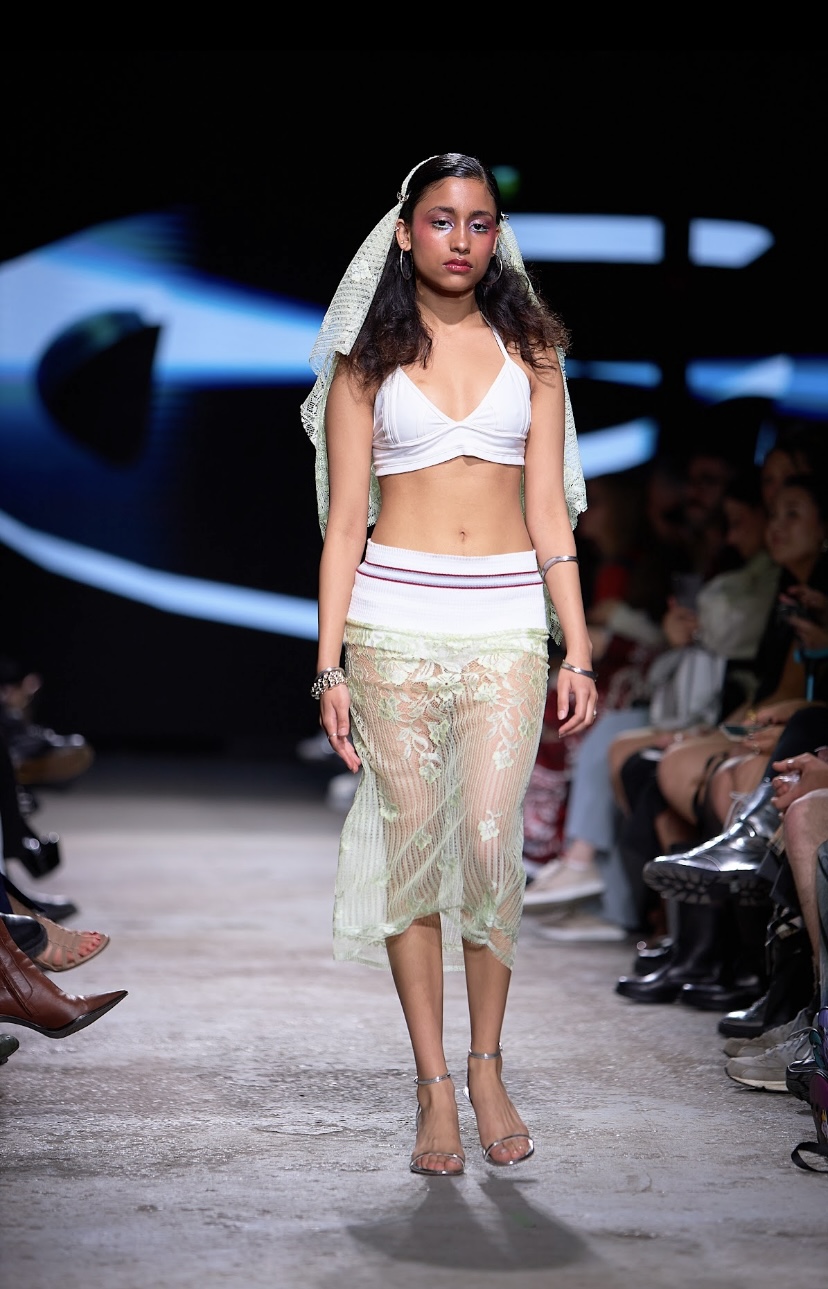
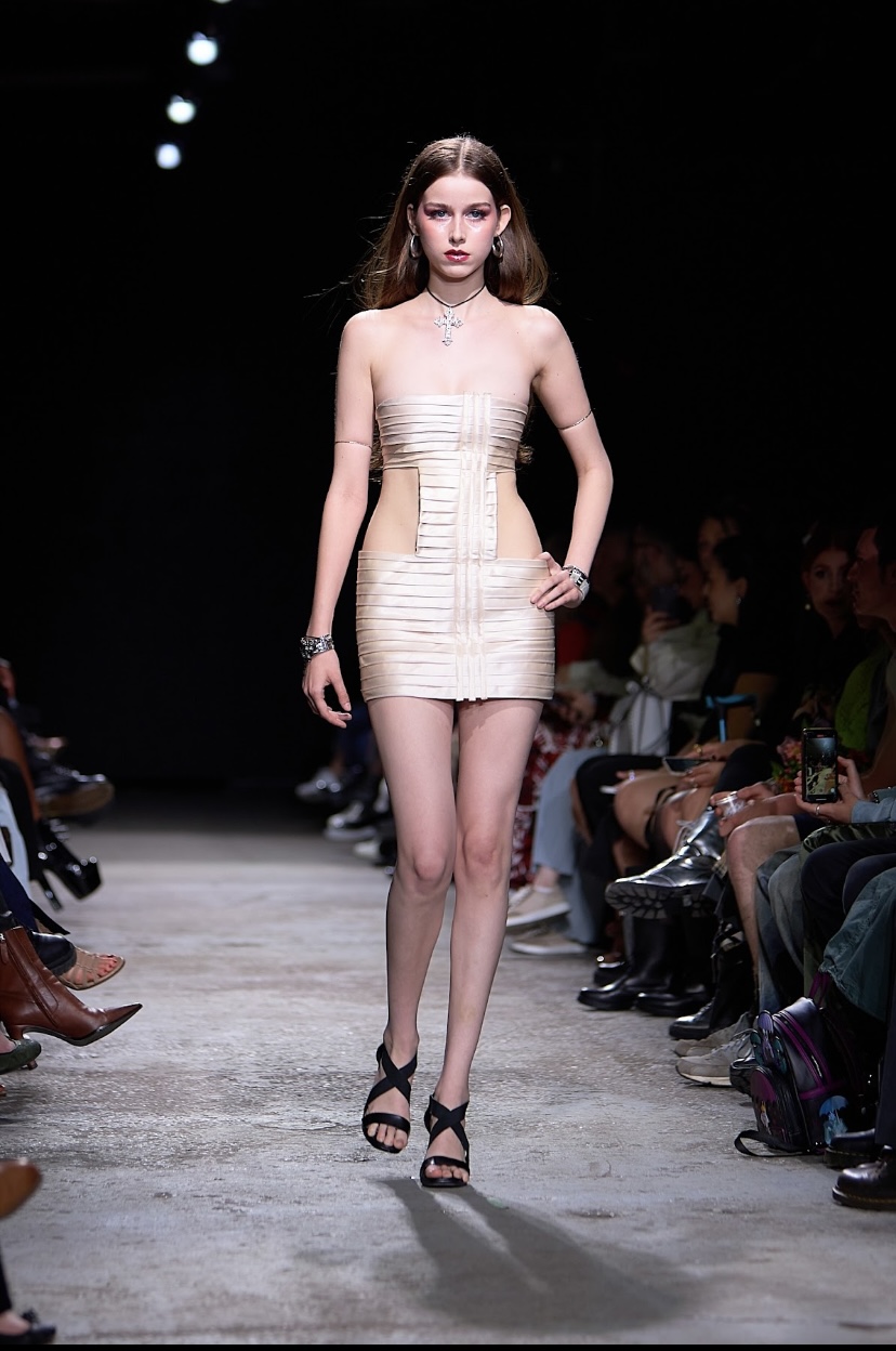
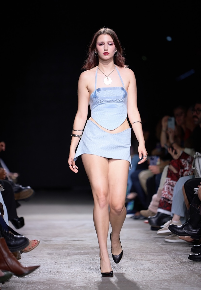
The transition from womanhood to girlhood is oftentimes daunting and involves deconstructing values enforced upon oneself since birth. HailMary’s collection ‘Debut’, created and designed by Mary Liang, subverted expectations of femininity. Liang herself is at the perfect stage in life to create this collection herself, recently graduating high school herself and having worked on this collection through her final year.
“This collection aims to subvert the misogynistic underpinnings of traditional beauty ideals,” Liang says, “reshaping the concept of femininity by harnessing tools and form […] seeking fusion of femininity and functionality through fashion.” With a distinguished air of blunt vulnerability, she says: “I have spent the past three years of my life trying to figure out what I want to do with my love for fashion and creation. This collection is a culmination of my journey to finding that goal.”
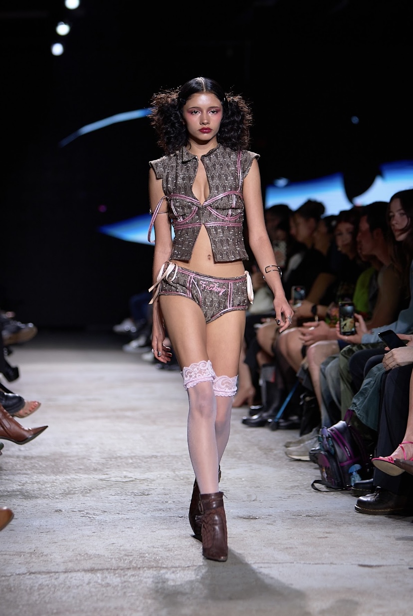
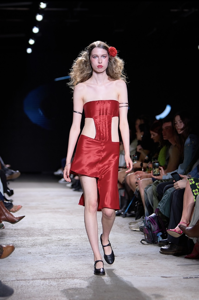
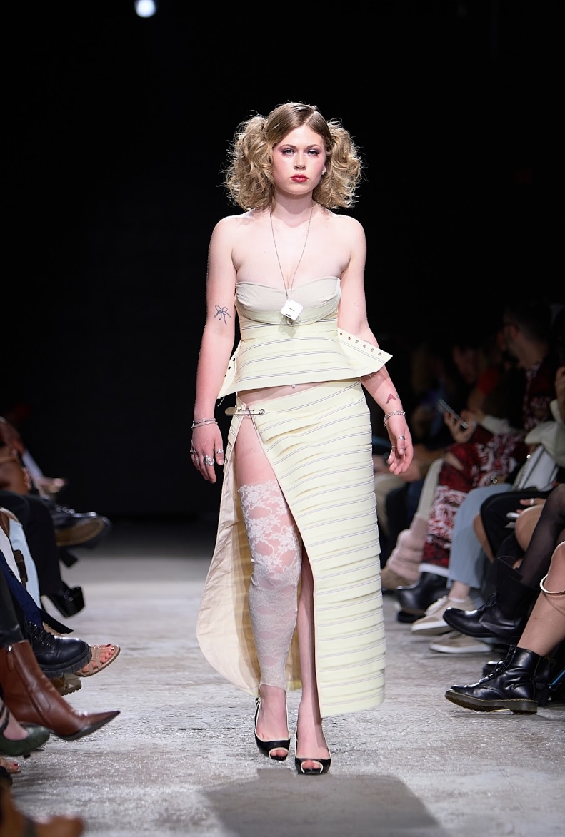
The garments combined elements of ‘girlhood’ such as Mary Janes (with knee high socks), florals, ribbons, and lace, whereas ‘womanhood’ was represented with pencil skirts, lingerie, and cocktail dresses. The colour palette was rather soft, consisting mainly of golds, pinks, silvers, neutrals and - exceptionally - a bold shade of red.
The makeup, overseen by Creative Makeup Director Jez Taylor, was usually natural but could get a bit vampy - contrasting with the sense doe-eyed wonder that their coquettish doll eyes invoked. The models looked like Bratz dolls come to life, albeit with an air of casual disinterest on their faces. Their hair, courtesy of the team run by Creative Hair Director Dylan Cruikshank, was either tight at the crown and poofed at the neck, or put up in girlish pigtails adorned with flower clips. Dresses were at once structured and supple, with tight corsets and daring cutaways. One look in particular consisted of a suit vest with the outline of a bra sewn into it. Some of the sexier looks were accessorised with veils, a classic symbol of Christian purity and a direct nod to the label’s name.
"Debut", HailMary. Fashion Art Toronto's 1664 Fashion Week SS24.
Photography by Matt Reid.
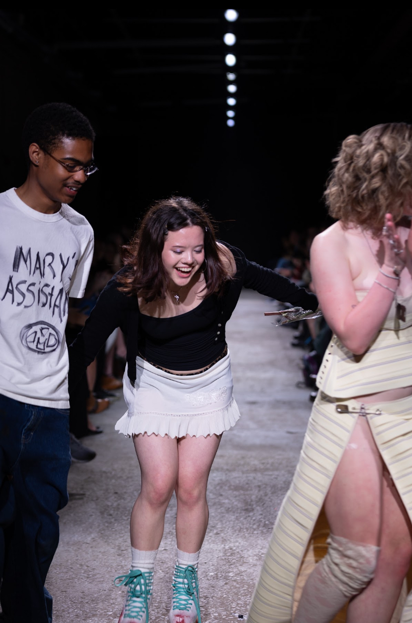
From this collection alone, it is clear that Hailmary is a brand with set ideals that they won’t shy away from expressing. At the end of the final walk, Mary rollerskates down the runway (definitely a Fashion Art Toronto first), hand-in-hand with her good friend, who wore a t-shirt with “Mary’s Assistant” hastily scrawled on the front and “I did HailMary logo + music” on the back. Undeniably, the kids are alright.
KYANA KINGBIRD
Kyana Kingbird’s collection ‘Pulling Punches’ sought to remove femininity from victimhood by portraying it from a different angle: one rooted in strength. “At the core of the feminine experience is violence, and yet strength is rarely considered an aesthetic aspect of femininity,” Kingbird affirms. “Under the male gaze, femininity is victimhood; you do not do things, things are done to you. To express aggression or protection is to have your femininity stripped of you. To deconstruct the idea of femininity is to remove the silk from an iron fist.”
The show began with a gorgeous traditional dance performed by Kingbird herself, who is of Mi’kmaw and Ojibwe descent, along with another performer in wearing a full feather headdress. The costumes they wore were grand, embellished with multicoloured feathers, as they took to the stage to the delight of the audience. The music faded to a hard trap beat as the runway began, and model Kamryn emerged like a panther on the prowl. Models were confident as they owned the floor in tight-fitting skirts and dresses. They waved their arms, effortlessly commanding all attention on themselves, and the clothes certainly obeyed. They glided ethereally down the runway, with a haunted look in their eyes.
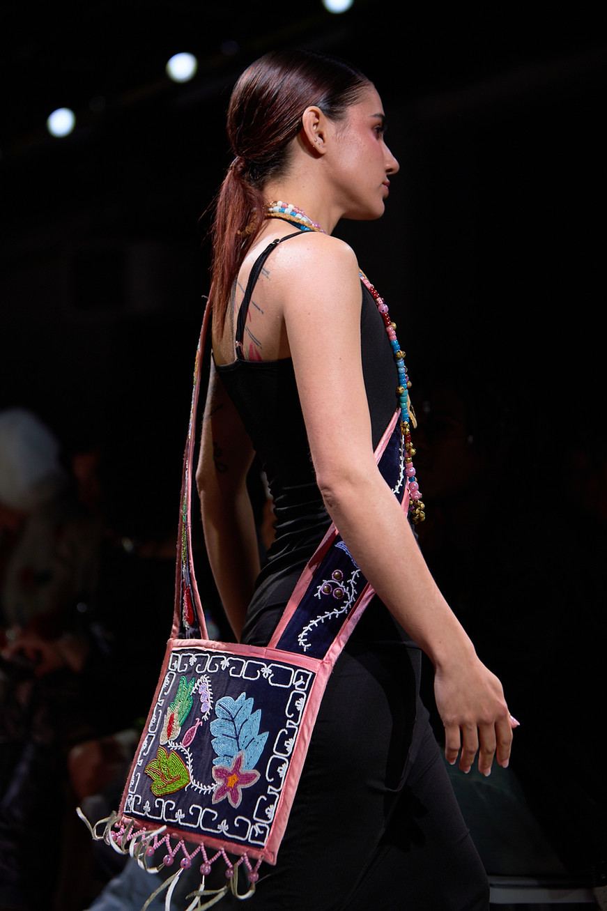
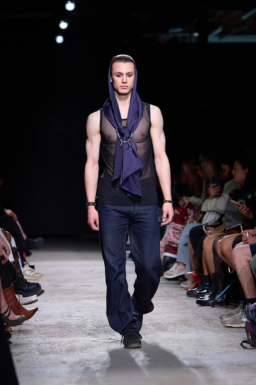
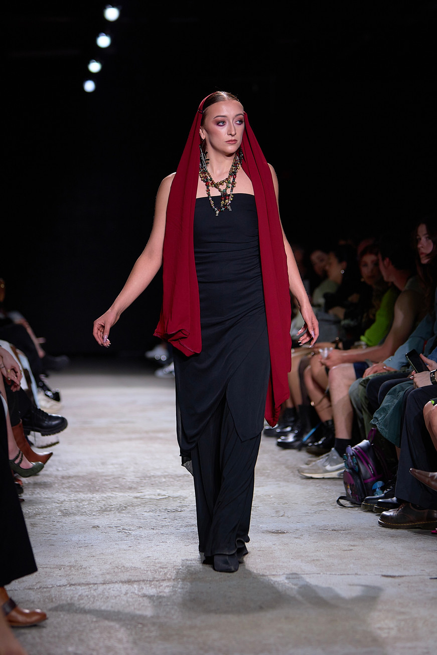
Beads were central to the collection, appearing as embroidered designs and colourful jewelry. The garments themselves were black, to further highlight these vivid colours. Models wear scarves over their heads and shoulders like veils. A few models wore AK-47 earrings, further showcasing the rage that Kingbird feels has been denied to women. We also saw a few playful touches - patchwork of floral and heart-shaped appliqués, and in one case, a pair of bow-shaped pasties under a mesh top.
"Pulling Punches", Kyana Kingbird. Fashion Art Toronto's 1664 Fashion Week SS24.
Photography by Matt Reid.
Despite everything women and femme-presenting people have gone through, there is a certain expectation for passivity. Those who face discrimination have every right to be furious at their situation and denying them that is a form of oppression in of itself. Kingbird herself took the final walk in her traditional Indigenous wear, her head held high.
CRERAR
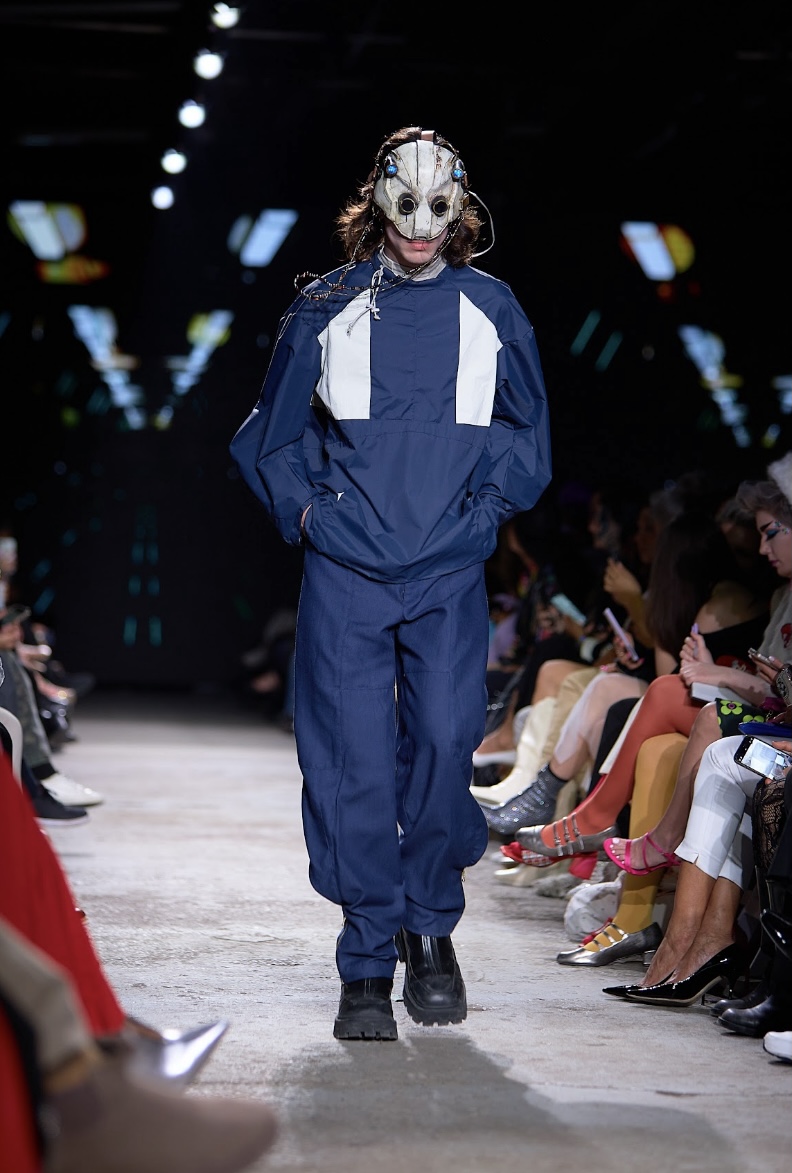
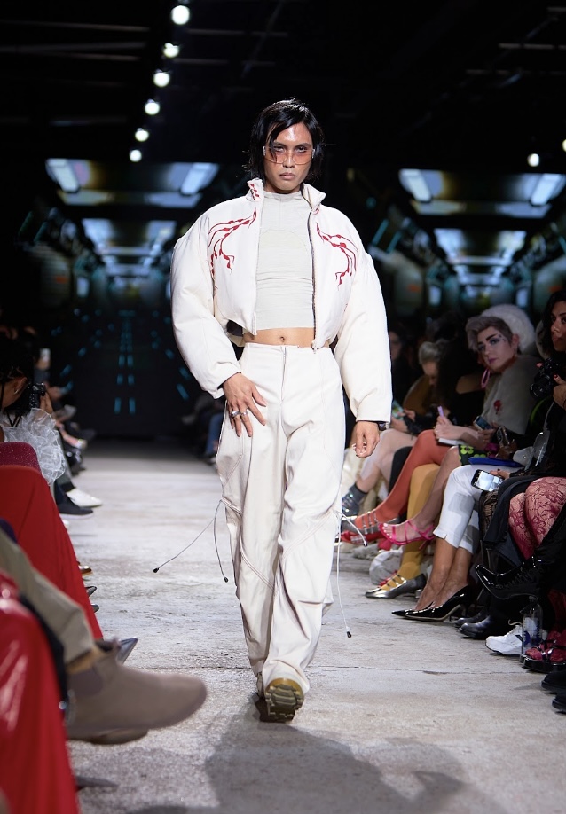
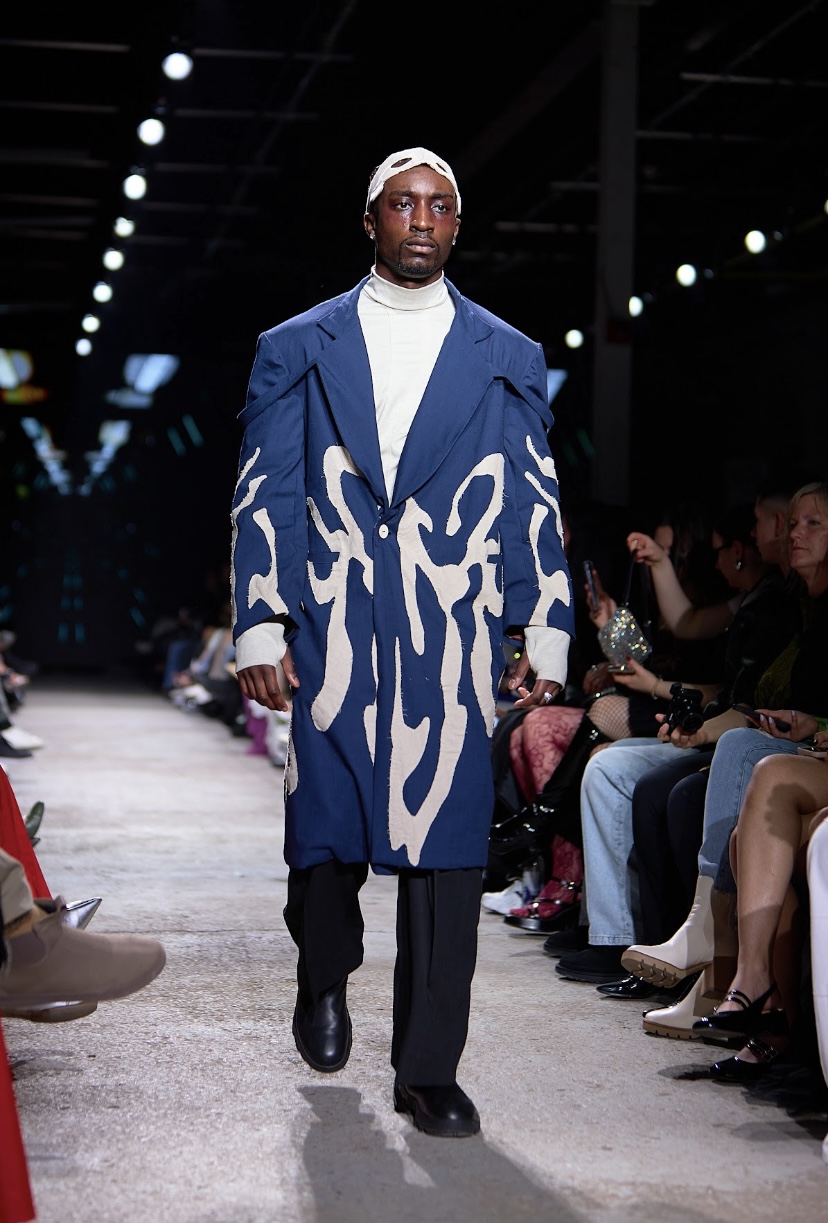
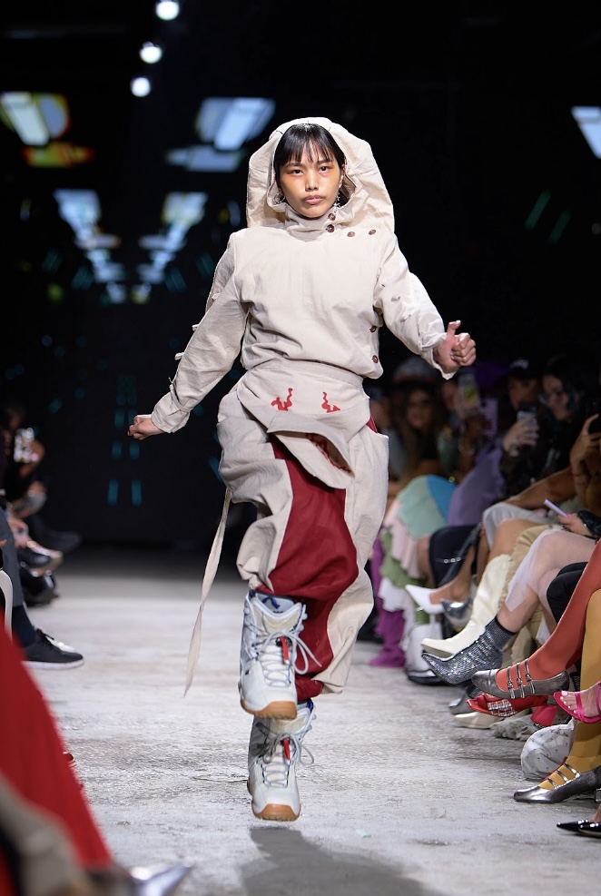
Crerar’s collection ‘Discrepancy’ explored their experience as a young adult with a chronic illness through the lens of sci-fi. “I want to portray the feeling of insidious consumption of your abilities tied to the experience of chronic illness,” says designer Kay Crerar. While the aesthetic most commonly associated with science fiction is made up of metallics and rigid geometric shapes, Crerar’s approach was moreso focused on displaying the internal parts of the human body on the outside.
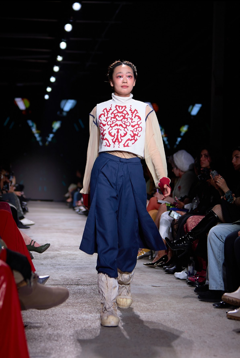
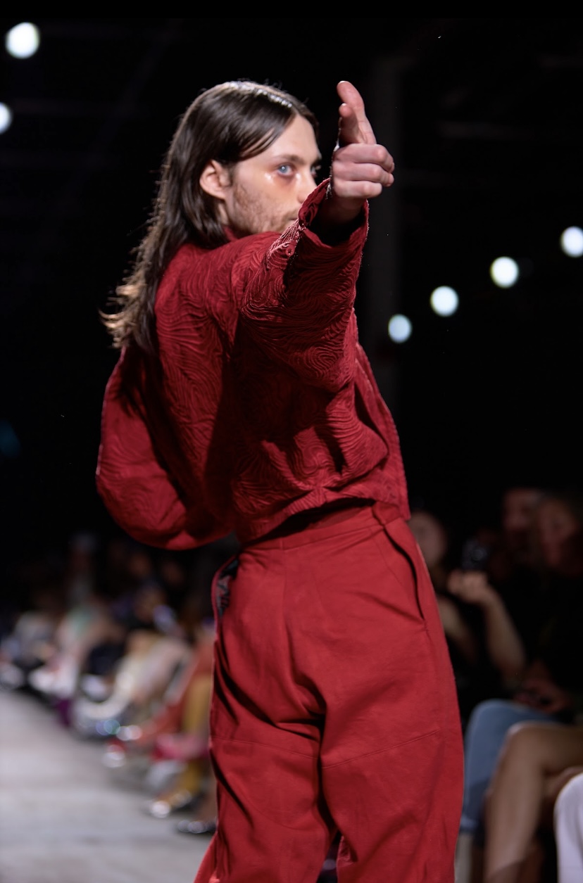
The backdrop on the screen was of a Tron-like spaceship interior, and the music was somber - “Empathy” by electronic group Crystal Castles and the like. The palette of the collection was mainly white with red detailing - this colour combination often associated with hospitals and first aid, likely due to the link between red and white blood cells. One jacket had a linear texture that made the garment resemble a pool of blood. A bright red graphic resembling both bones and internal organs frequently appeared on white garments, the pale base fabric making the crimson pop. A blue coat was lined with red fabric on the inside, giving it the appearance of flesh.
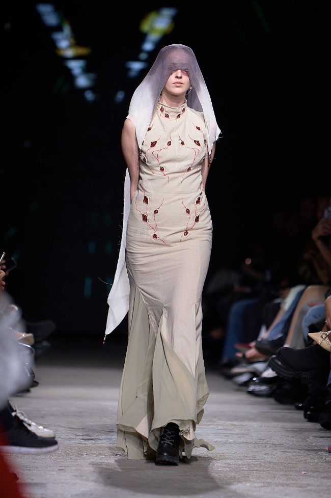
The most quintessentially sci-fi addition to this collection was a white futuristic mask with a beaded chain that swayed from side to side as the model walked down the runway. The look that best embodied the essence of the collection was a beige tight-fitting dress that clung to the model’s body, embellished with small red orbs emerging from the gown like tiny little blood vessels. The model’s eyes were covered by a white veil, tainted by a deep purple dye. The elegance of the piece, combined with the futuristic essence of the collection, conjured images of Padme Amidala and other royals from Star Wars.
"Discrepancy", Crerar. Fashion Art Toronto's 1664 Fashion Week SS24.
Photography by Matt Reid.
The makeup made the models seem slightly sickly, at times even giving them the appearance of being bruised and cut up in a way that only an illness can. The models were direct and confident (with model Caity in a futuristic Jester’s outfit even skipping down the runway) despite having no control over the rot that slowly consumed them from the garments, and from within themselves.
COURAGE BY NISHA
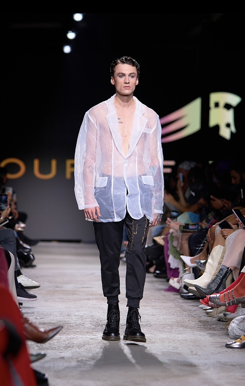
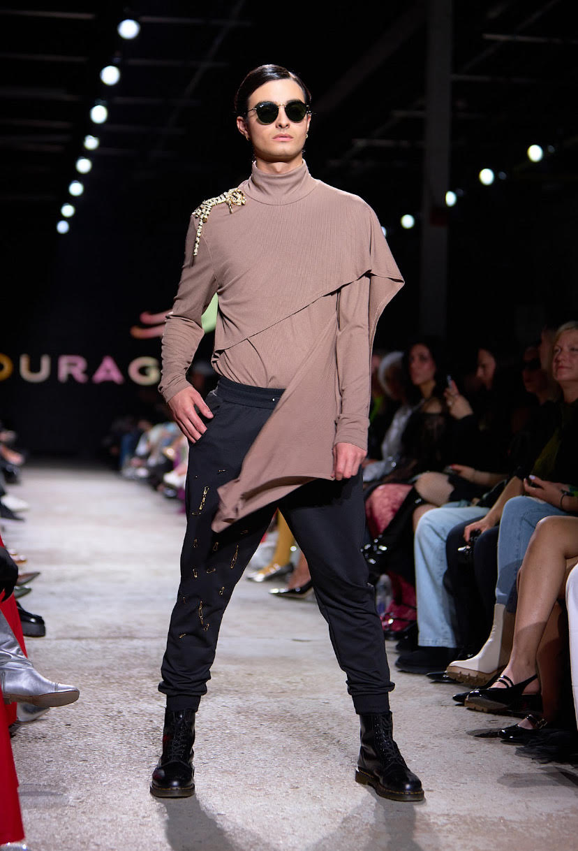
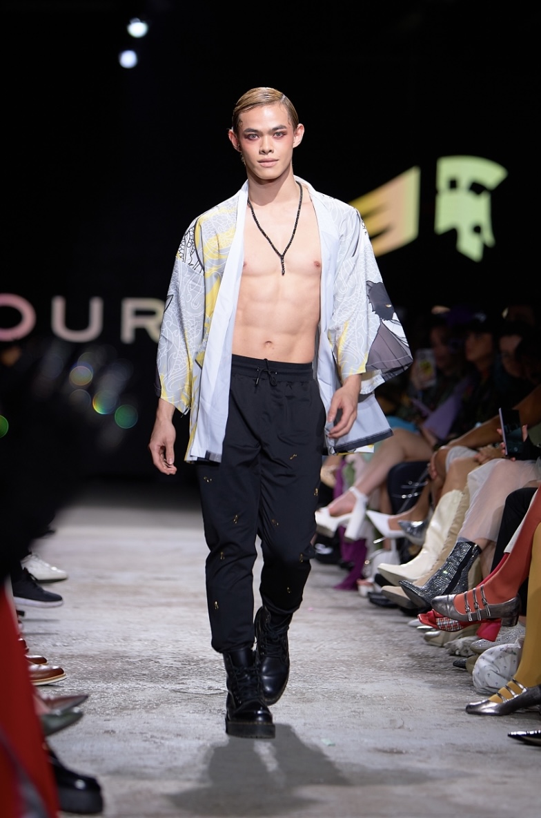
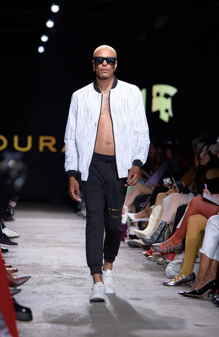
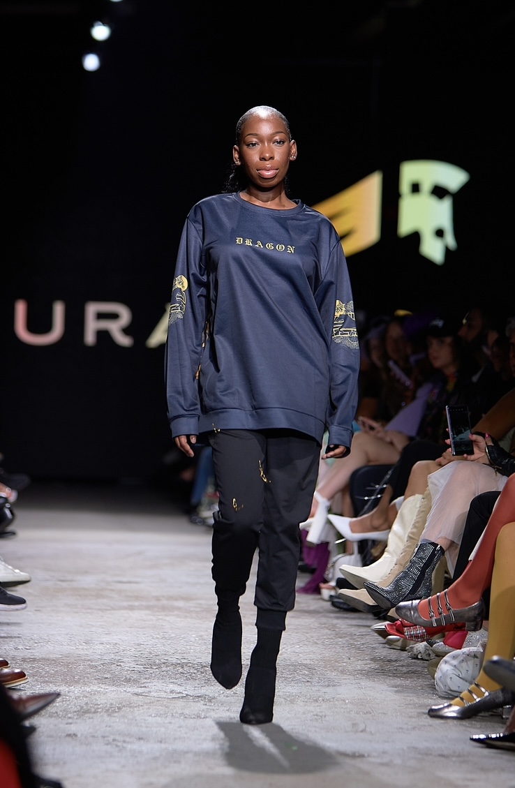
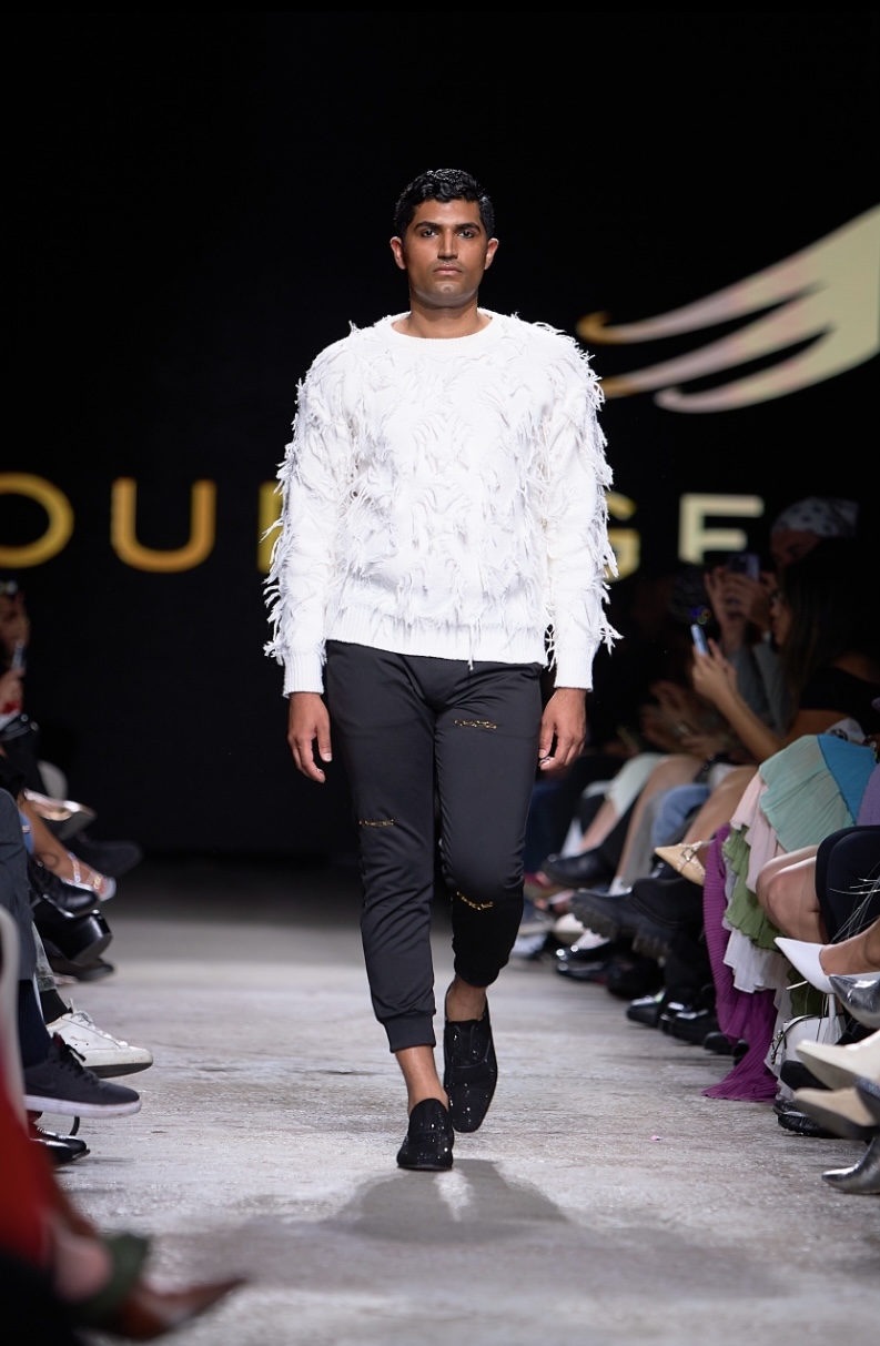
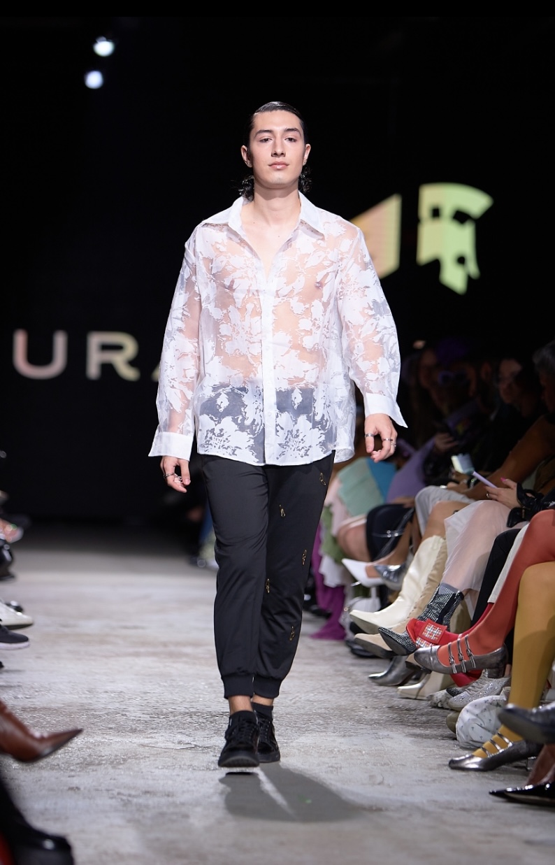
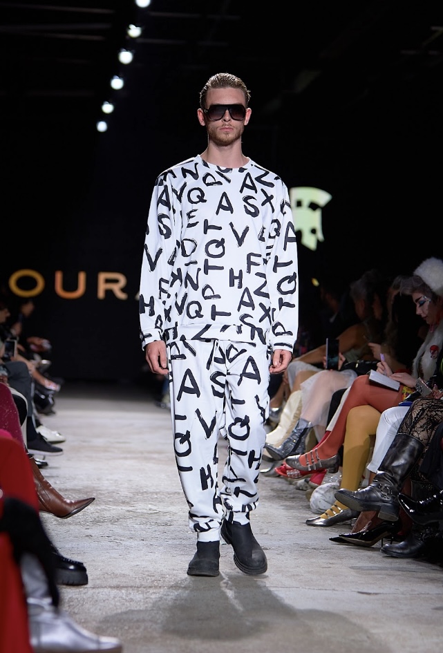
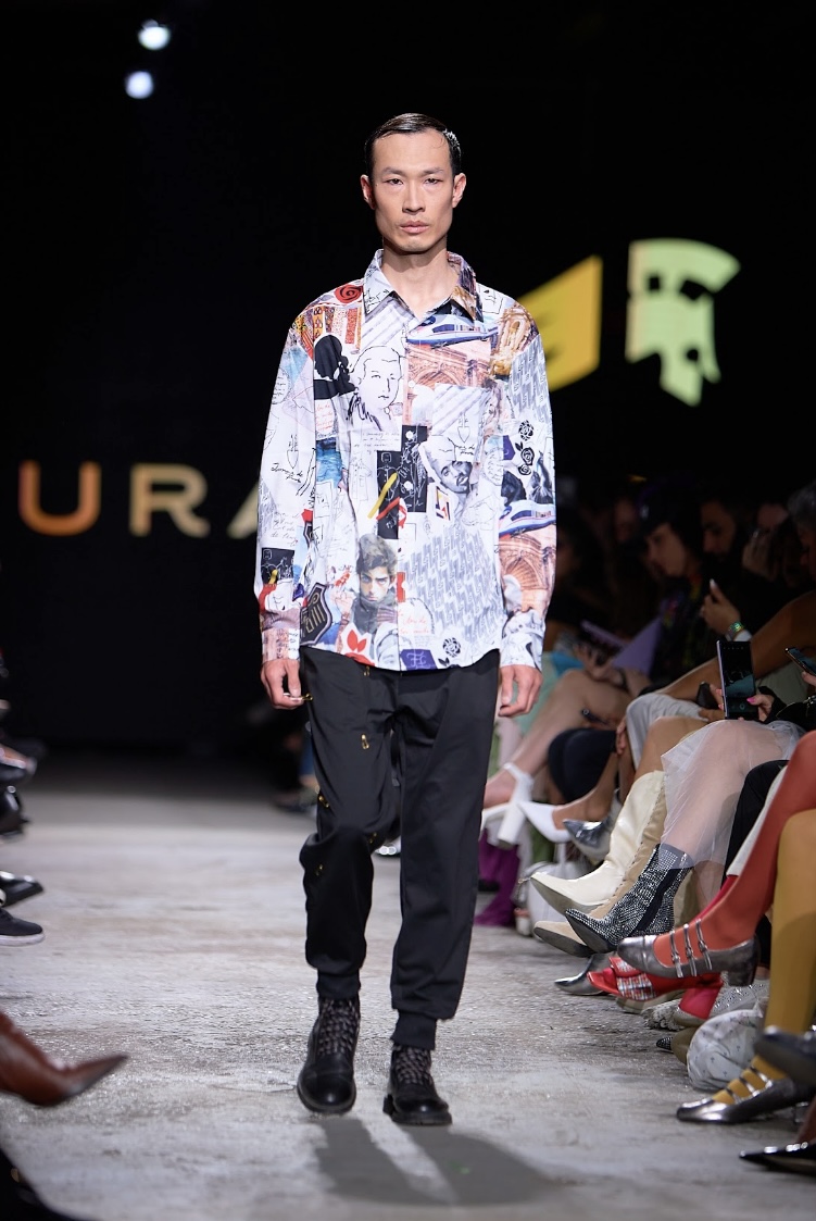
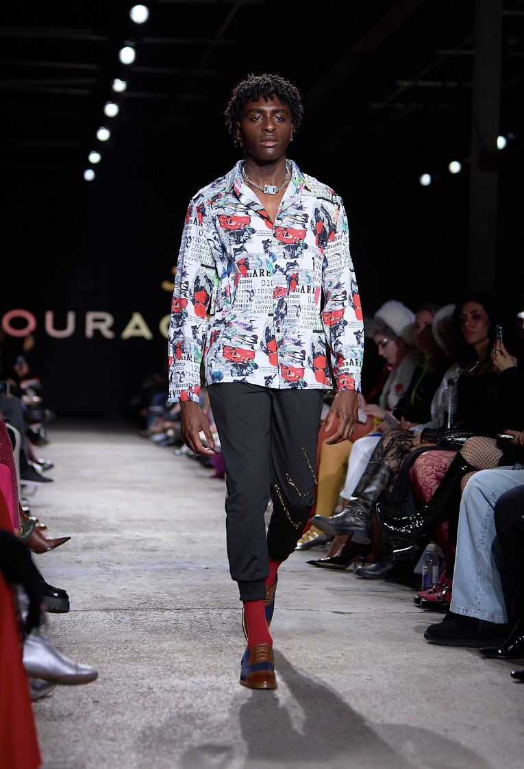
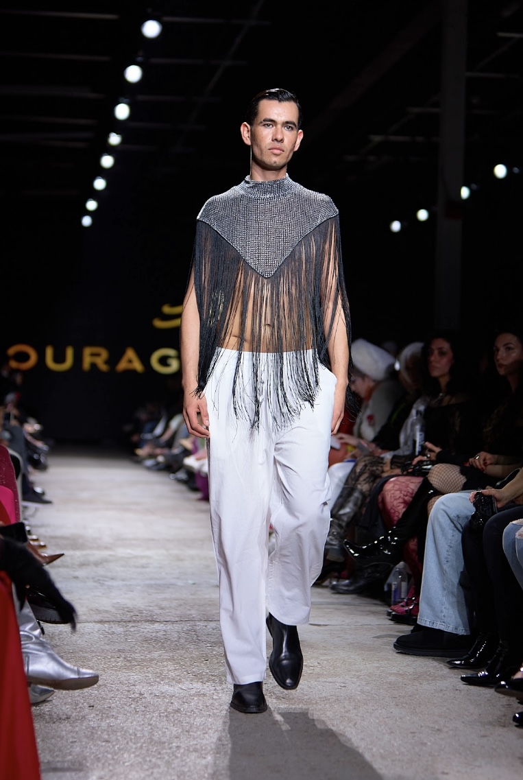
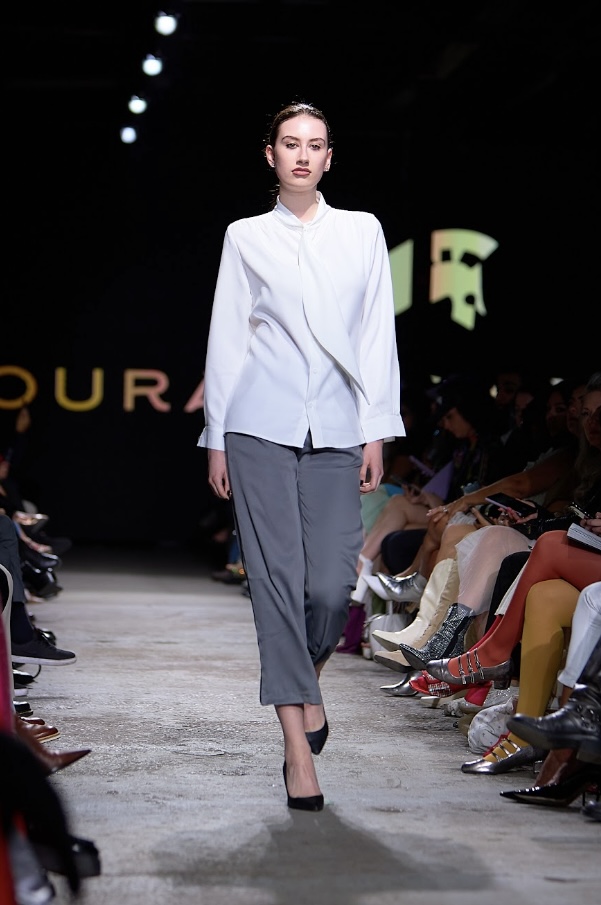
Inspired by counterculture, Courage by Nisha hopes to "connect [to one's] inner warrior through collections with significant style and timeless class". For the "Endure" collection, designer Nisha Haroon was on a mission to showcase humanity’s strength and resilience. A montage played on the big screen of people working out, fighting fires, and other displays of enduring motivation in a grainy, sepia tone. The film ended and lights flashed in a strobe pattern over the room as ‘FANTASTIC BABY’ by BIGBANG began to play in the background, effectively hyping up the crowd.
The fabrics used were light, yet maintained a confident allure with their impeccable tailoring. Chains and sheer fabrics clung to the models’ bodies, giving off a distinct allure of effortless cool. It was an enhanced version of more basic wear - a glittery bomber jacket, a sweatsuit covered in random black letters. Jewelry was understated, as well as makeup and hair. Animals that represent power, such as the dragon and the tiger, made frequent appearances in the collection through the form of pins and prints. It wasn’t subtle either - one top had “DRAGON” emblazoned on the front and an image of the mythical creature plastered on the back.
"Endure", Courage by Nisha. Fashion Art Toronto's 1664 Fashion Week SS24.
Photography by Matt Reid.
Business attire was also an important part of the collection, with the strongly implied message being that it is difficult to thrive without hustling. The brand’s logo, a Roman gladiator, perfectly embodies the essence of endurance. Courage by Nisha showed that it is not a brand for quitters. It’s a brand for winners.
CIRQUE DU SOLIEL (Performance)
To the delight and surprise of 1664 Fashion Week attendees, two performers from Cirque Du Soliel acted out a live advertisement for their show in residency, “Echo”. You’ve most likely seen their advertisements on public transit - a woman with striking red hair seemingly blends into the cloudy backdrop behind her. True to the visual theme, a cloudy sky appeared on the big screen as two performers took to each side of the runway. A man dressed in a sky-blue cloudy suit (and an intricate wolf mask) juggled bright orange balls at the pit while his rather flexible companion contorted her body next to him. The performance was brief but dazzled the crowd, who were left considering visiting the circus tents downtown while they still have the chance.
GEMINE DESIGN
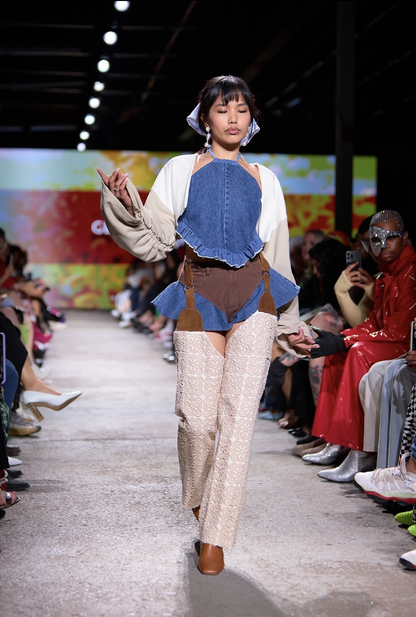
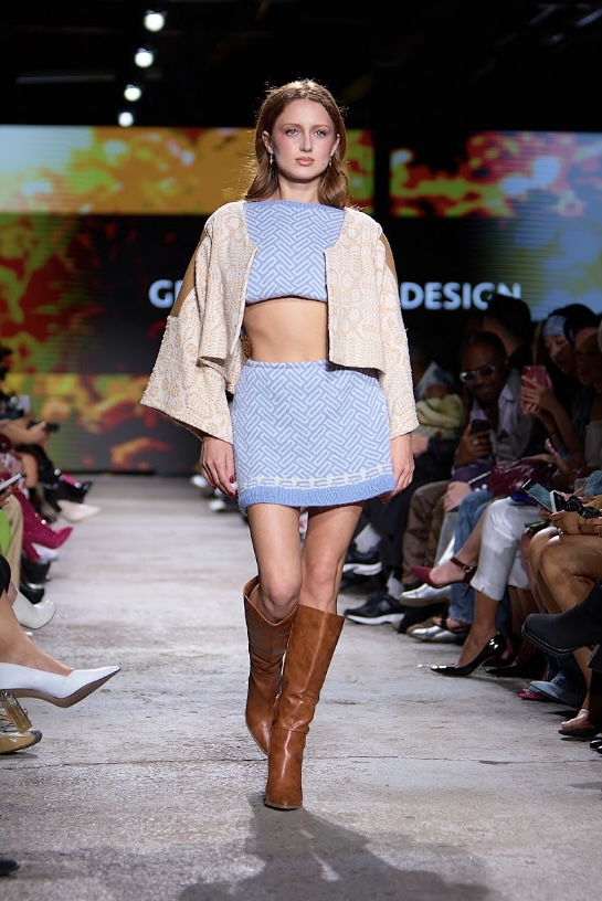
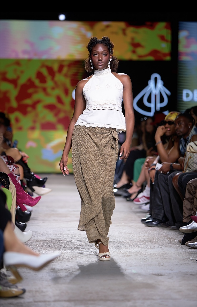
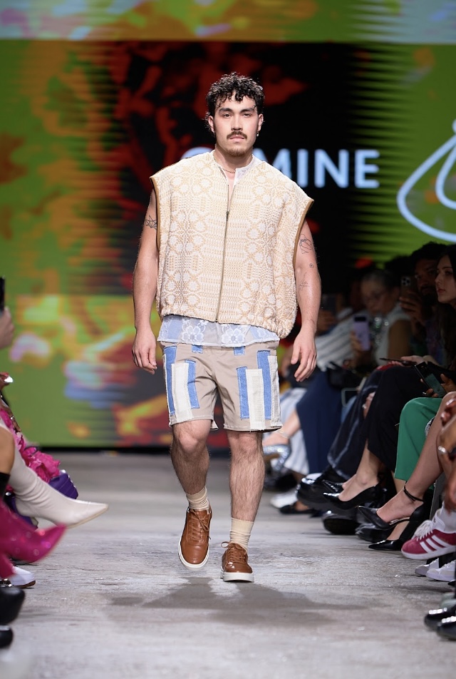
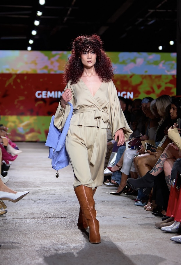
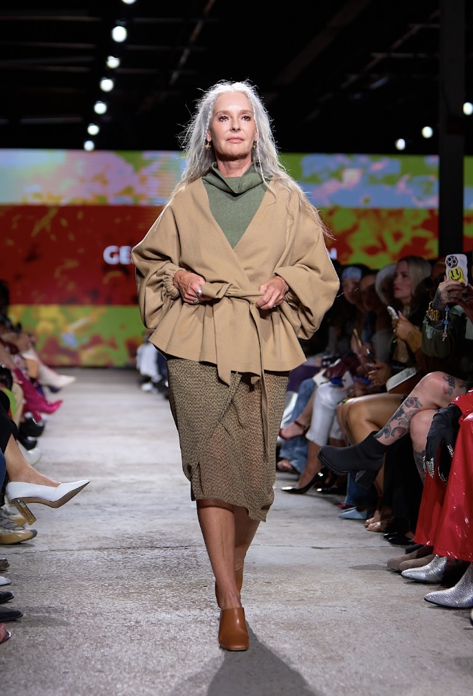
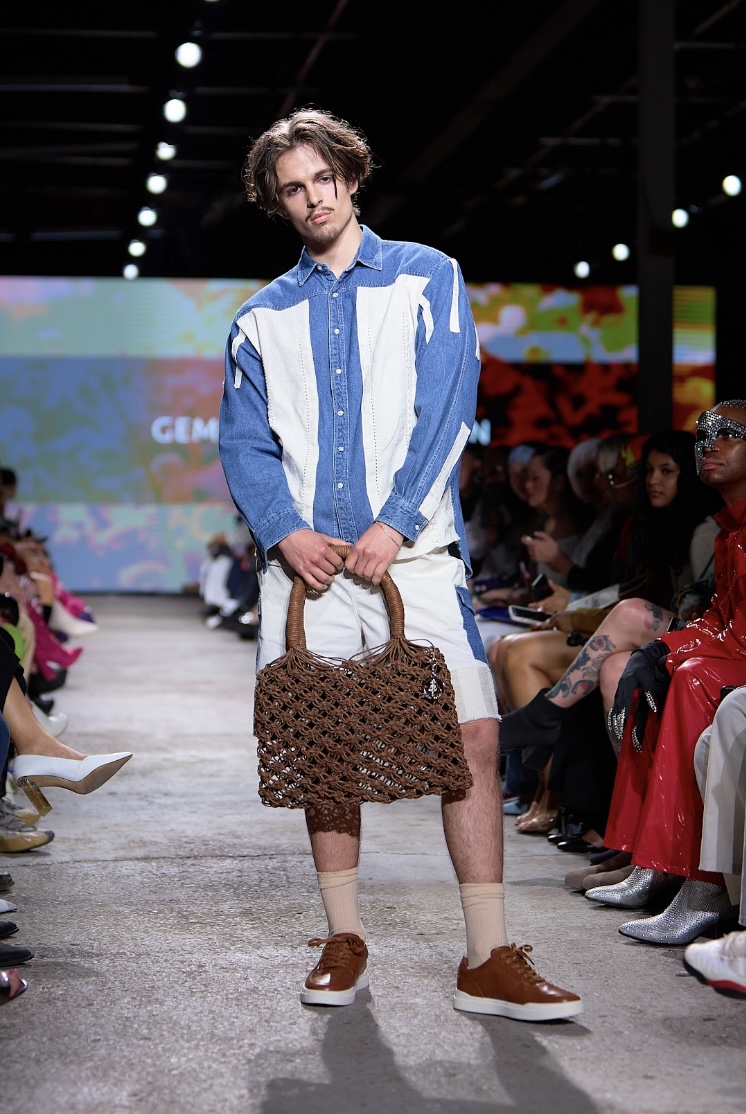
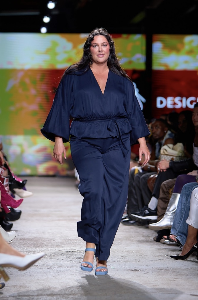
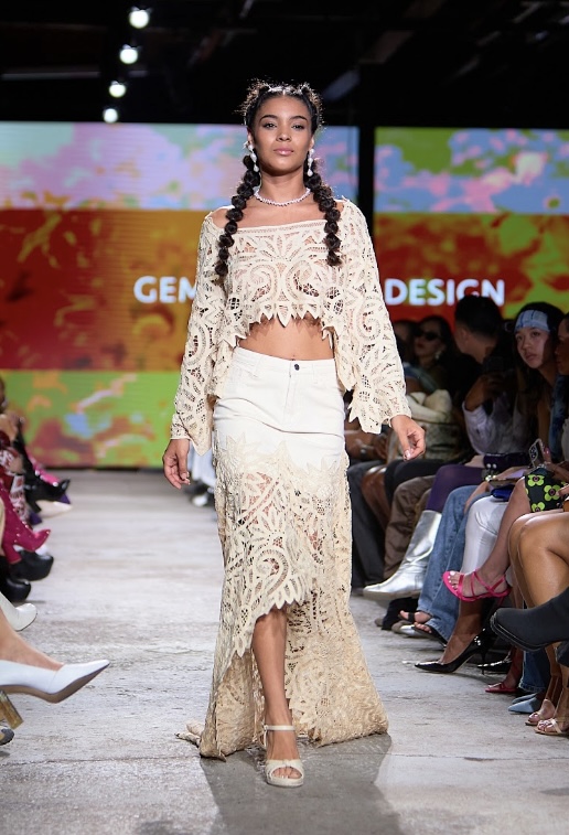
Gemine Design’s ‘Forget Me Not’ collection was dedicated to the innocent children suffering at the hands of adult selfishness. Designer Michelle Good is not only interested in sustainability for fashion’s sake, but also for investing in the future of our planet. Gemine Design is firm in their belief of human rights for all children and, as such, proceeds from this collection will be donated to Save The Children, an organization directly aiding young people in need. “We believe the future of our humanity lies with the children of today,” muses Good.
The garments themselves were up-cycled, true to the brand’s core values of sustainability, and took great inspiration from the ‘60s and ‘70s. Aside from being fashionable and iconic, these eras were also a time of great development when it came to social justice and human rights. Along with the Black Power movement and Second Wave Feminism, Anti-War sentiment in the United States grew quite a bit of traction as a response to the televised cruelty of the Vietnam war. There are many parallels to be drawn between the state of the world then and the current day.
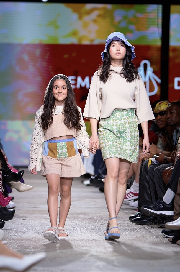
Despite the collection’s seemingly lighthearted nature - at least at first glance - it is clear that a lot of thought and intention went into all aspects of this show. The garments were mostly made up of a neutral colour palette (creams and caramels) with the exception of blue denim - “the periwinkle blue of the Forget Me Not flower”, Good specifies - frequently making an appearance. Crocheted florals gave the garments both a vintage and home-made feel, making it difficult for one not to be transported to the warmth of their childhood home. Notably, nostalgia can offer people a sense of protection. The hair and makeup was very natural, allowing the models’ features and the clothes to truly shine.
"Forget Me Not", Gemine Design. Fashion Art Toronto's 1664 Fashion Week SS24.
Photography by Matt Reid.
The highlight of the show was the moment when a models walking down the runway holding the hand of a young girl, who proudly made her debut in a floral crochet set. The excitement and joy reflected in her expression is one that should be found in every child, and cemented Good’s mantra for the collection - “children should be free”.
THE DYEVERSE
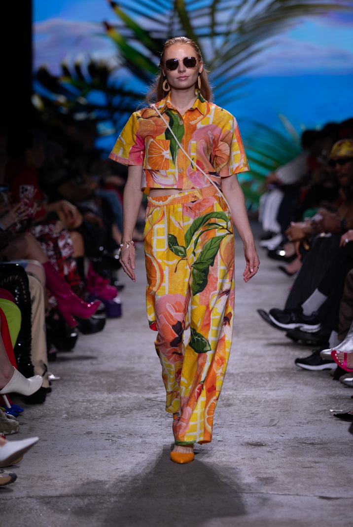
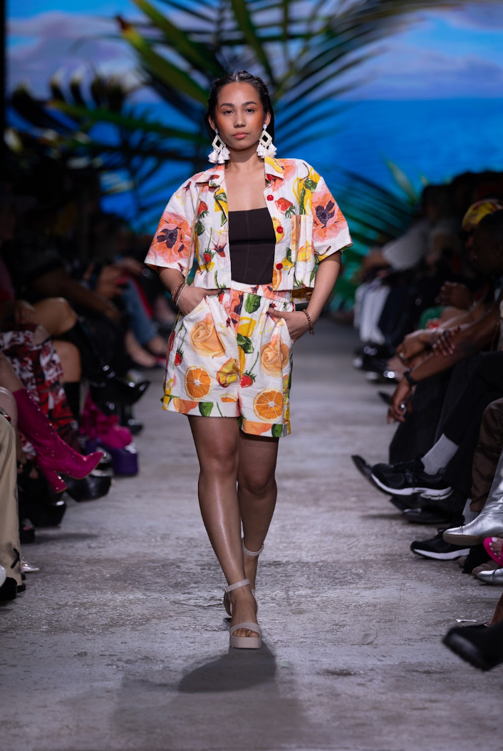
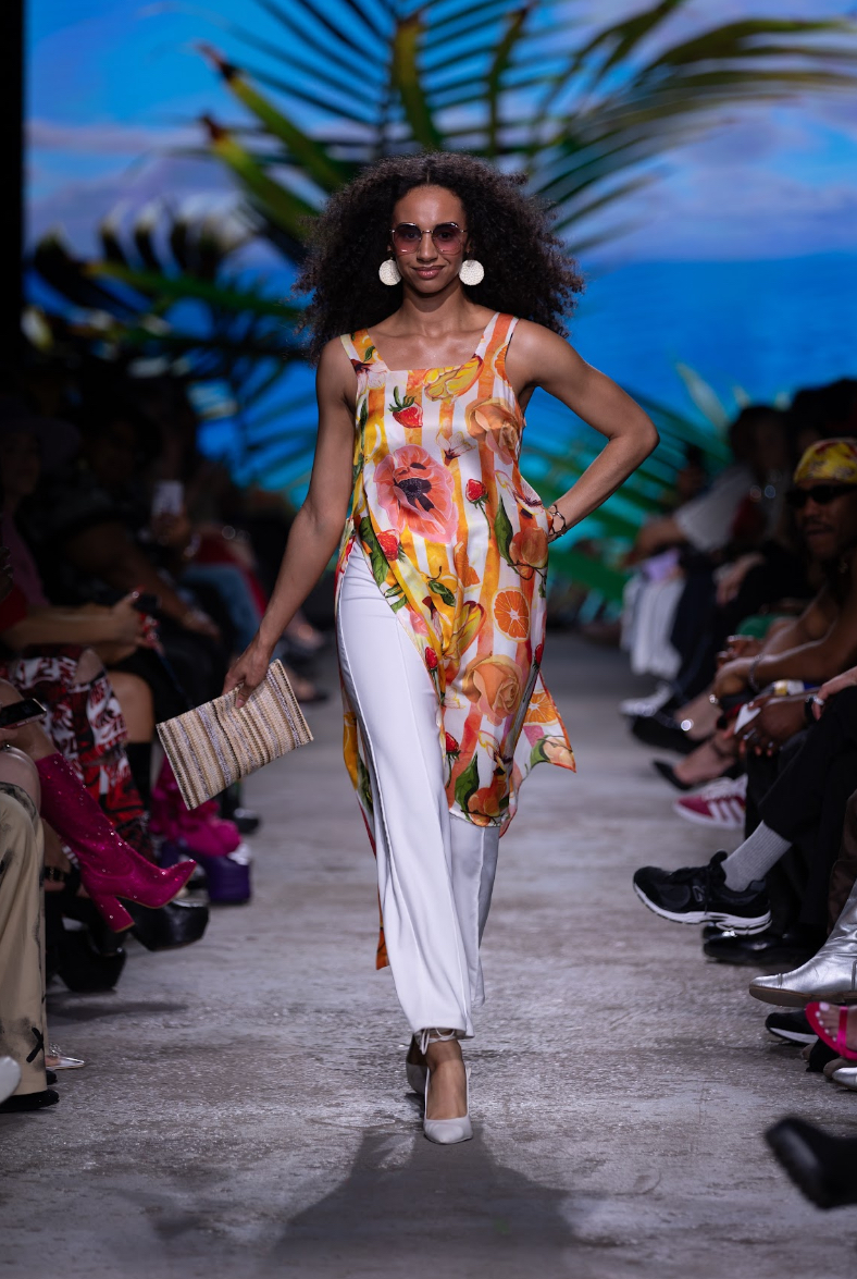
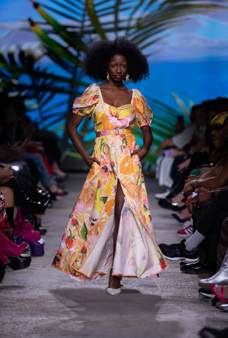
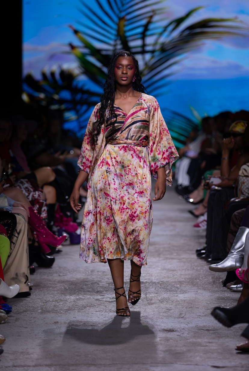
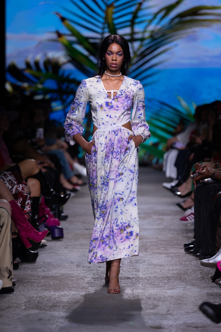
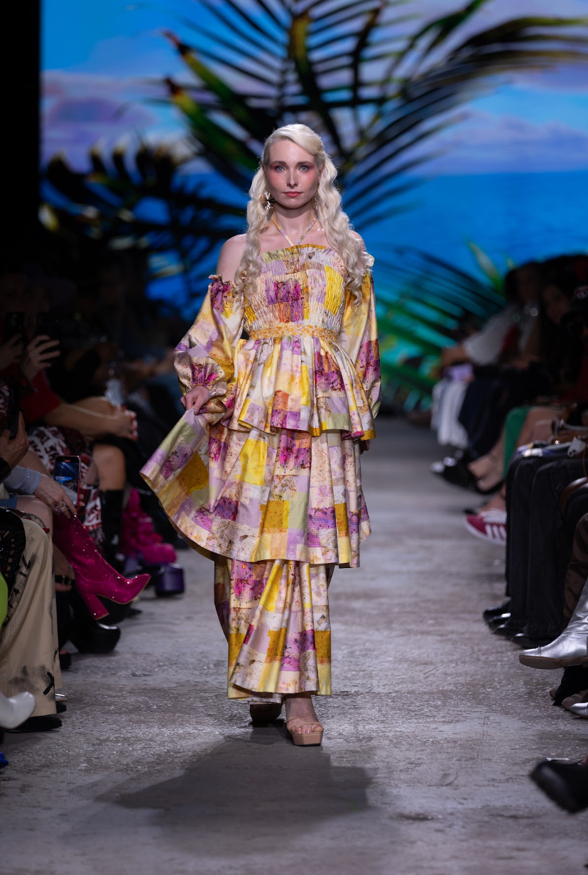
‘Resort Bloom’ from The Dyeverse was the epitome of tropical fantasy. Attendees were transported to a much warmer climate as the screen filled with a video of a beautiful sunset, with the occasional shadow of a colony of gulls flew past. The models had a pep in their step, accompanied by the tune of sunny SoCa music and the hollow beat of a steel drum.
Designer Rosa Wharton was heavily inspired by Caribbean culture and sustainability, opting for light, breezy fabrics and fruity prints featuring citruses and strawberries. With textiles that she designed herself, her goal was to “celebrate the essence of spring and summer through a combination of motifs and dyes”. Wharton explains that “at the heart of ‘Resort Bloom’ lies a commitment to environmental sustainability. Crafted from natural fabrics, the collection emphasizes comfort and luxury through simple yet sophisticated silhouettes. ‘Resort bloom’ is an explosion of colour paired with effortless elegance where every piece is a celebration of life, style and individuality.”
"Resort Bloom", The Dyeverse. Fashion Art Toronto's 1664 Fashion Week SS24.
Photography by Jack Hathaway.
Models wore fun geometric jewelry and pumps that complimented the cheerful vibe of the collection. Princess necklines and puff sleeved dresses added to the whimsy of summer longings. Halfway through the presentation, darker colours began to emerge along with variations in print. Tousled hair, along with a sun-kissed glow, gave the impression that the models had just come back from a long day soaking up rays at the beach. Wharton added to the positive vibes of the show by dancing down the runway during her designer walk, to a chorus of whoops and cheers from the crowd.
MUULBERRY x GERVACY
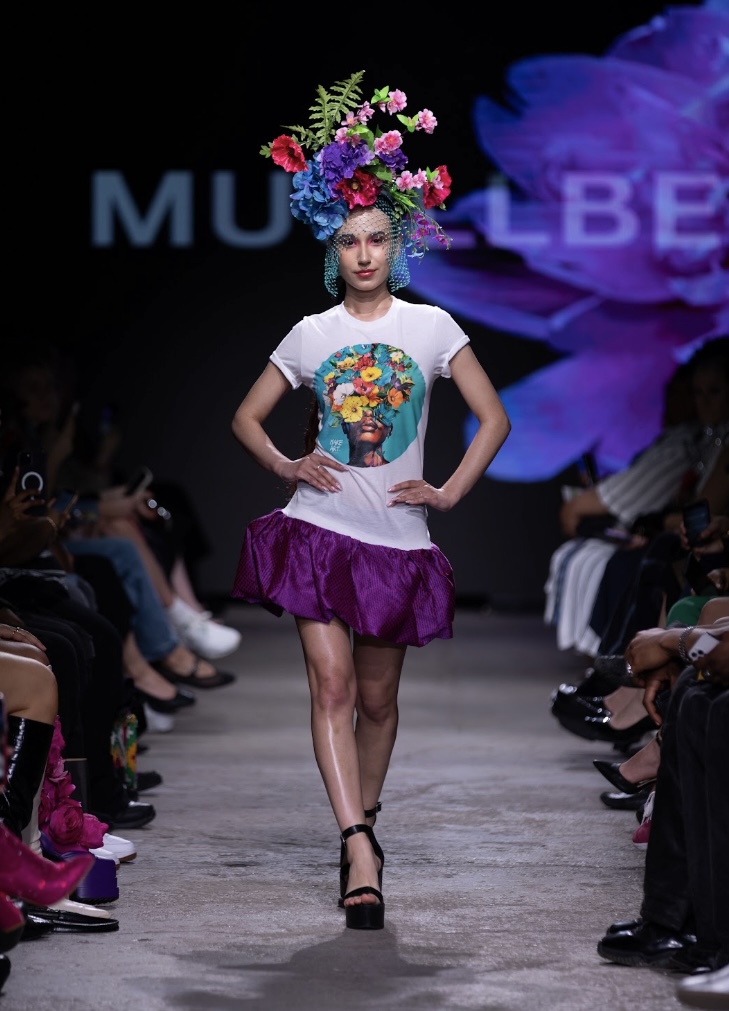
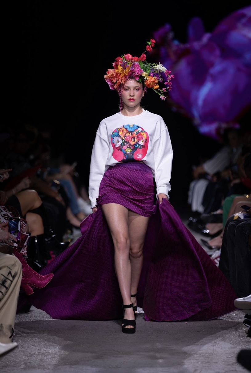
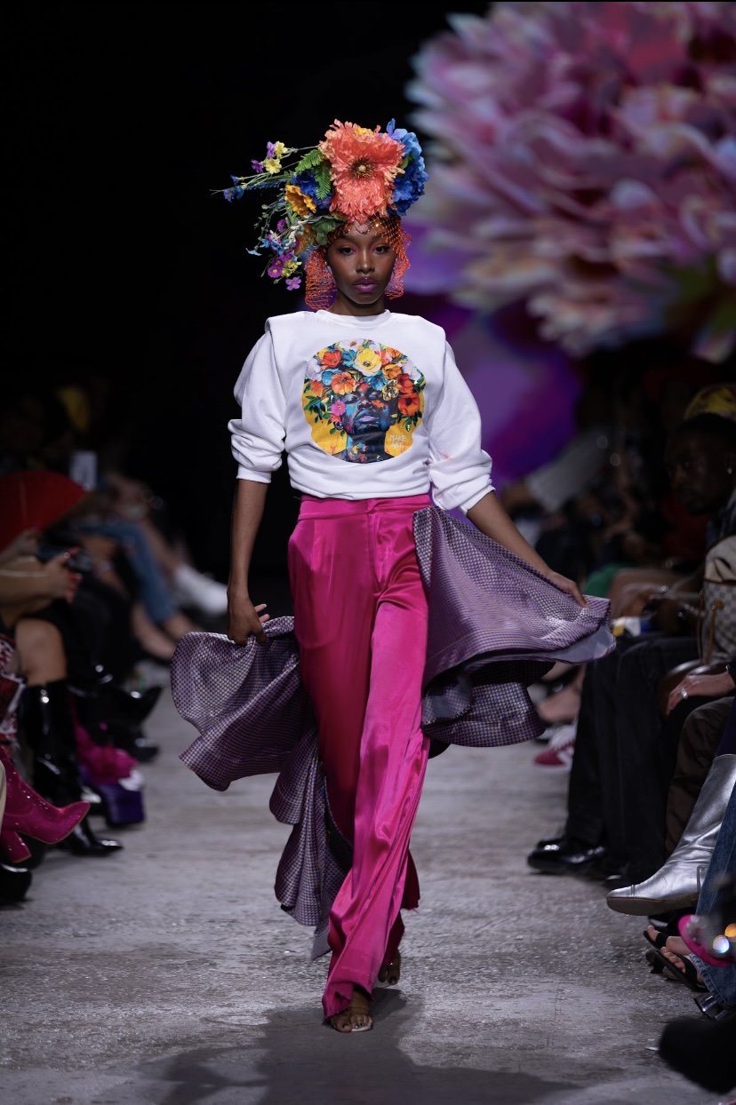
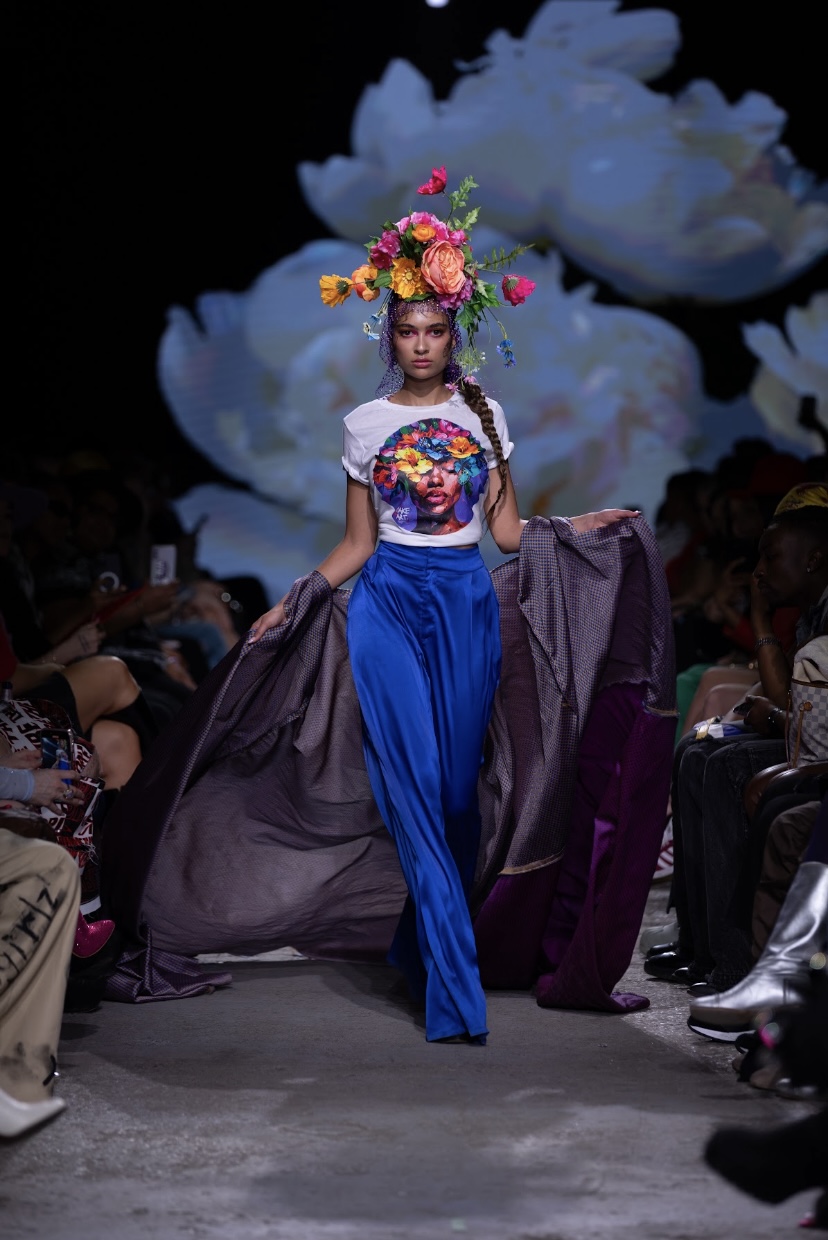
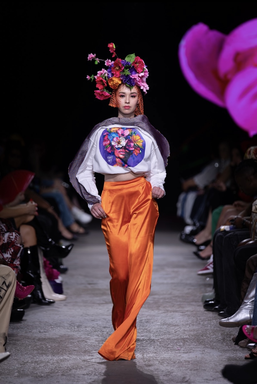
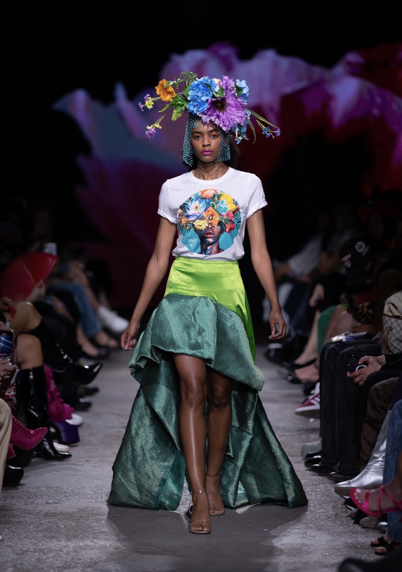
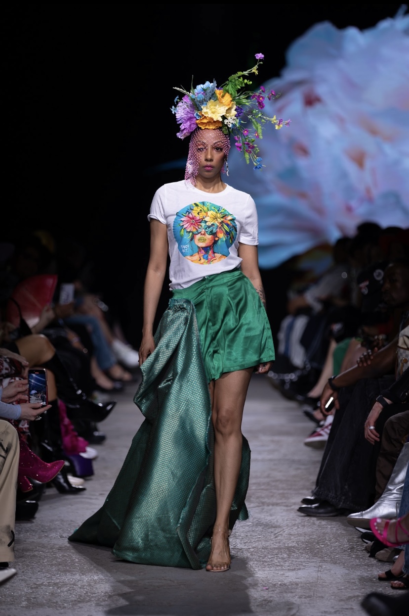
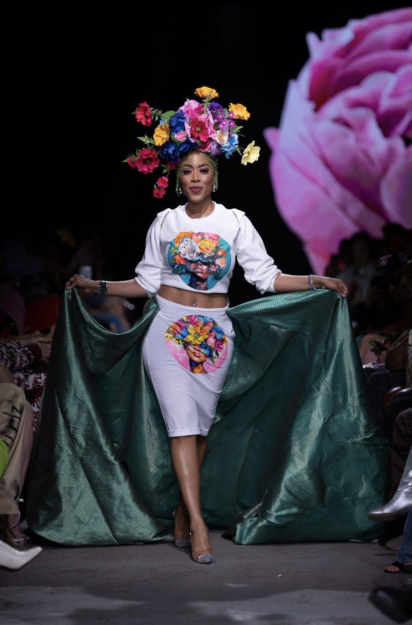
For those still coming into their own, MUULLBERRY X GERVACY’s collection ‘BLOOM’ is sure to help you blossom. MUULLBERRY, known for their bold floral prints, beautifully integrated the essence of the brand with GERVACY’s avant-garde denim pieces and structured fabric additions.
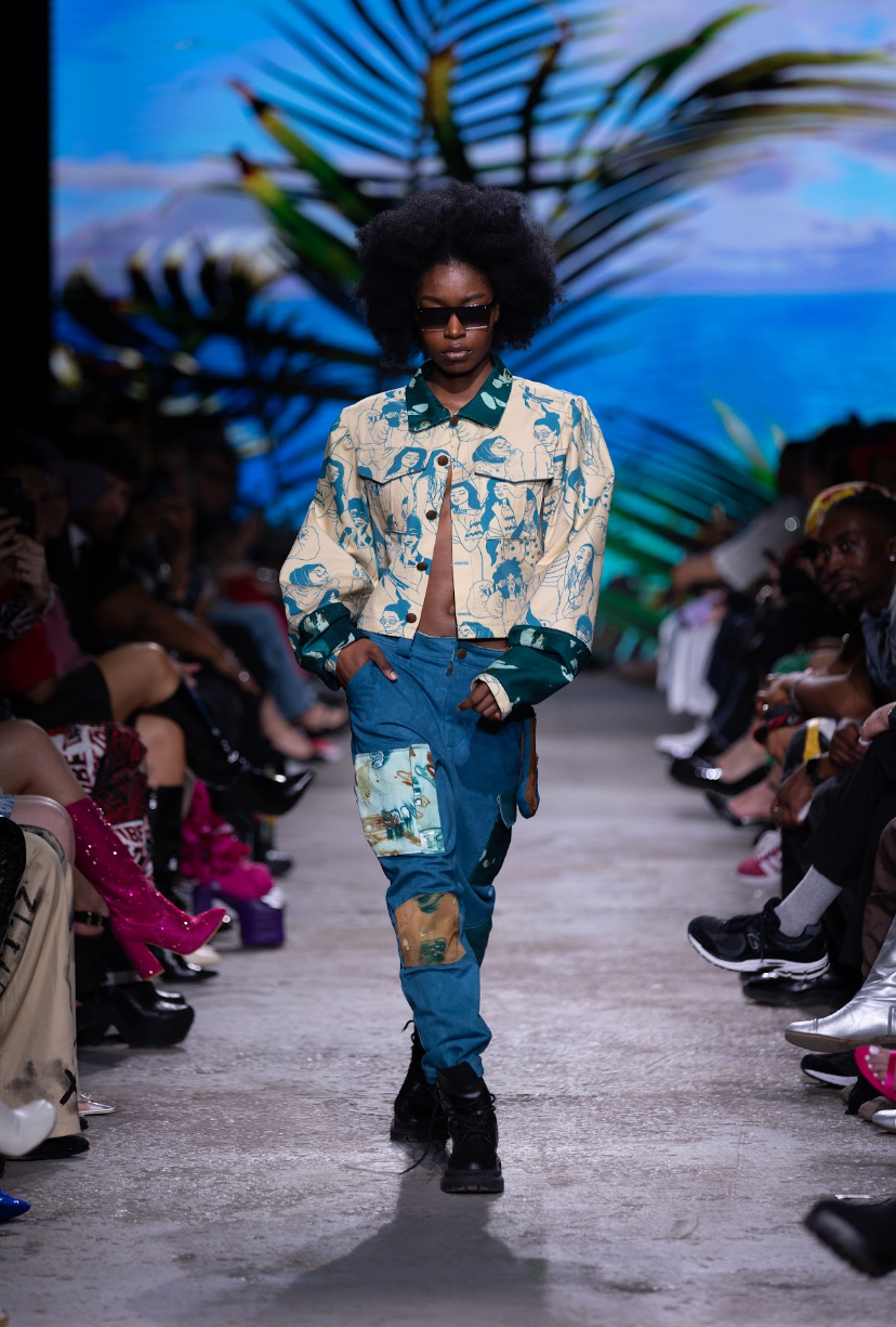
To begin the show, a time-lapse of a beautiful blooming pink flower filled the screen, while a woman’s soft voice repeated the phrase “just be, just be, just be.” Model Naaliyah stepped onto the runway in a massive flower crown with pink rhinestone netting draped elegantly over her face. This would begin a theme, as all models wore giant floral arrangements on their heads and sparkly veils while long green trains, resembling the leaves off of stems, followed behind them as they longed the runway. Their printed t-shirts and sweatshirts, courtesy of MUULLBERRY, featured portraits of women with large, bright bouquets as elaborate mock-hairdos. While the tops were simple, the bottoms were decidedly not, as Gervacy’s satin pants and skirts played with structure, angle and design.
"BLOOM", Muullberry x Gervacy. Fashion Art Toronto's 1664 Fashion Week SS24.
Photography by Jack Hathaway.
Every look was pure artistry - Designers Anita Surma and Kyle Gervacy certainly didn’t shy away from using vivid colours that most would find intimidating. Instead, they embraced the colours of spring, creating their own floral rainbow. The makeup was pretty, but embraced colour once again with bright red lipsticks and bold eyeshadows. The models certainly enjoyed themselves on the runway, spurred on by the energy of the crowd. Closing the show was Patricia Jauggernauth, Emmy award winning television host, who walked with a distinct air of confidence and grace - the perfect energy to end such a lively showcase.
NEECHI BY NATURE
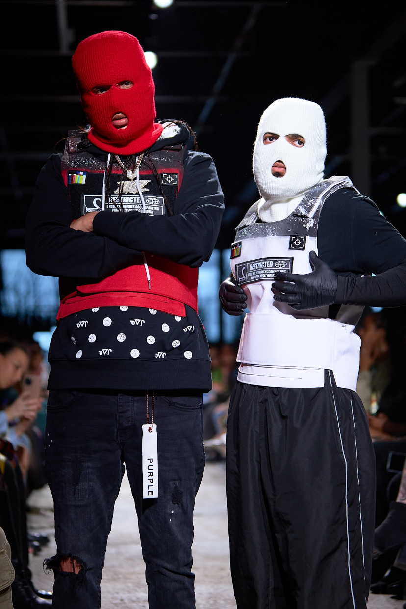
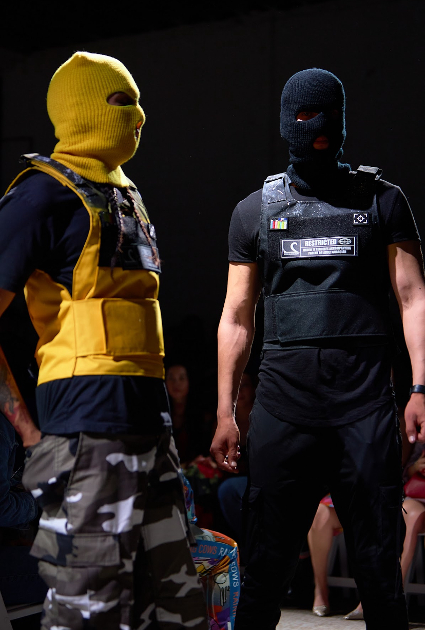
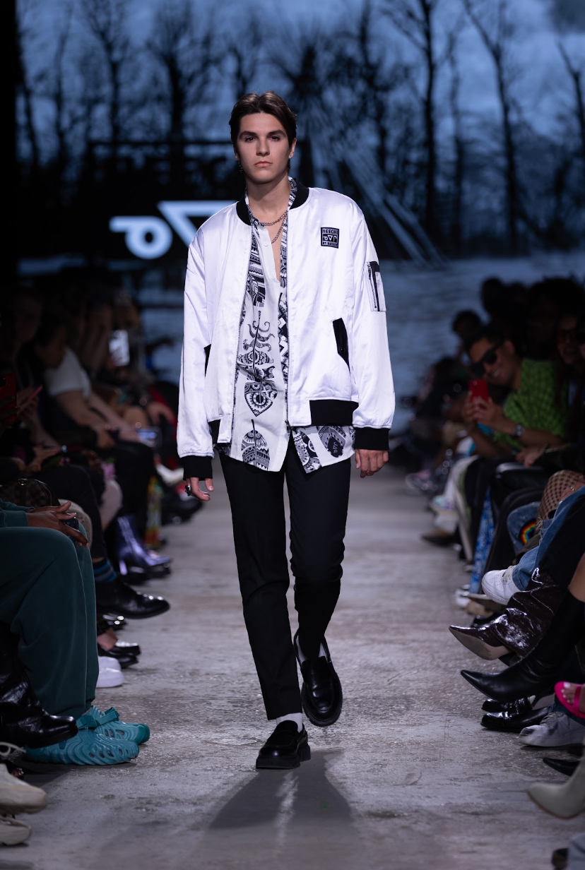
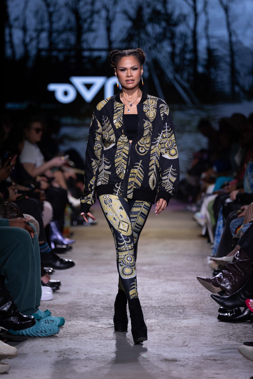
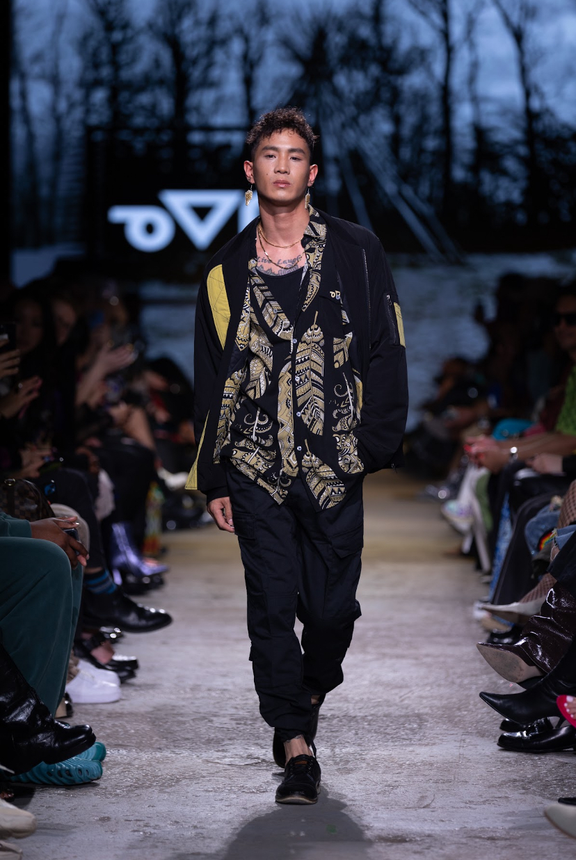
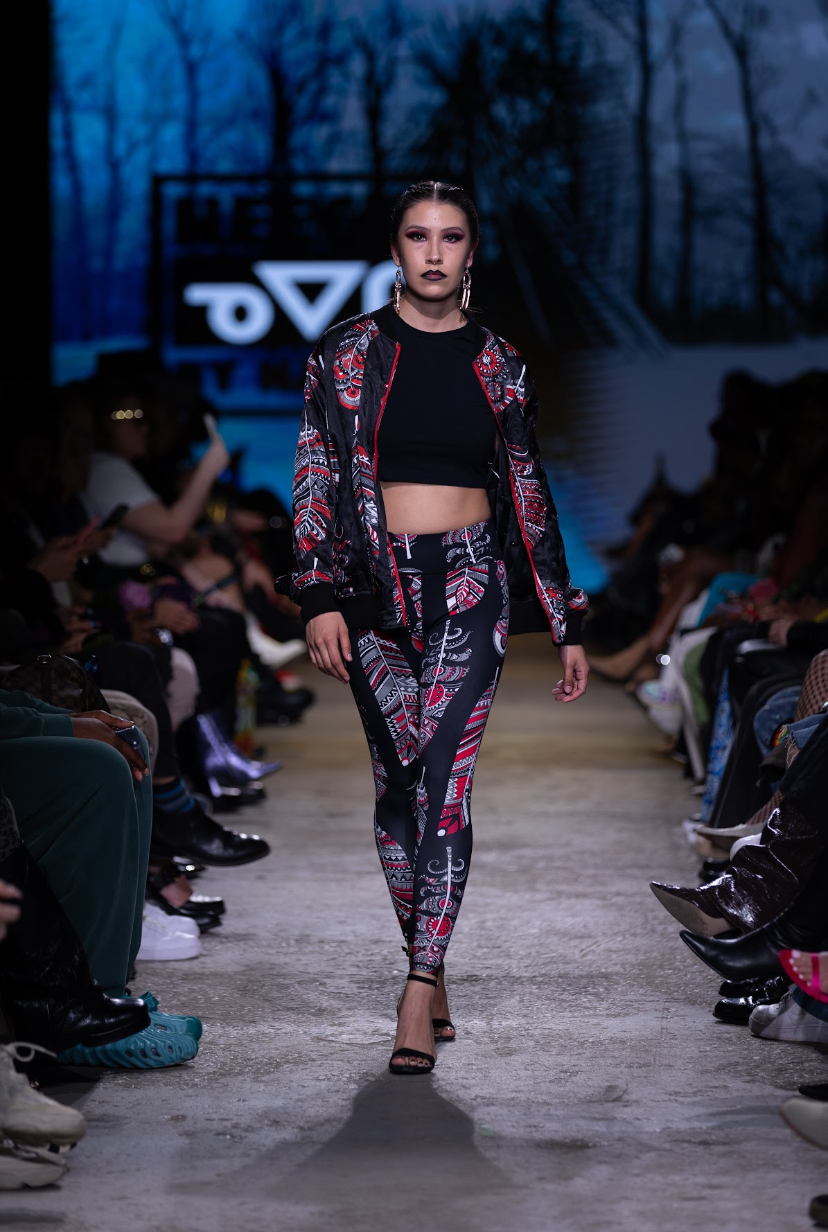
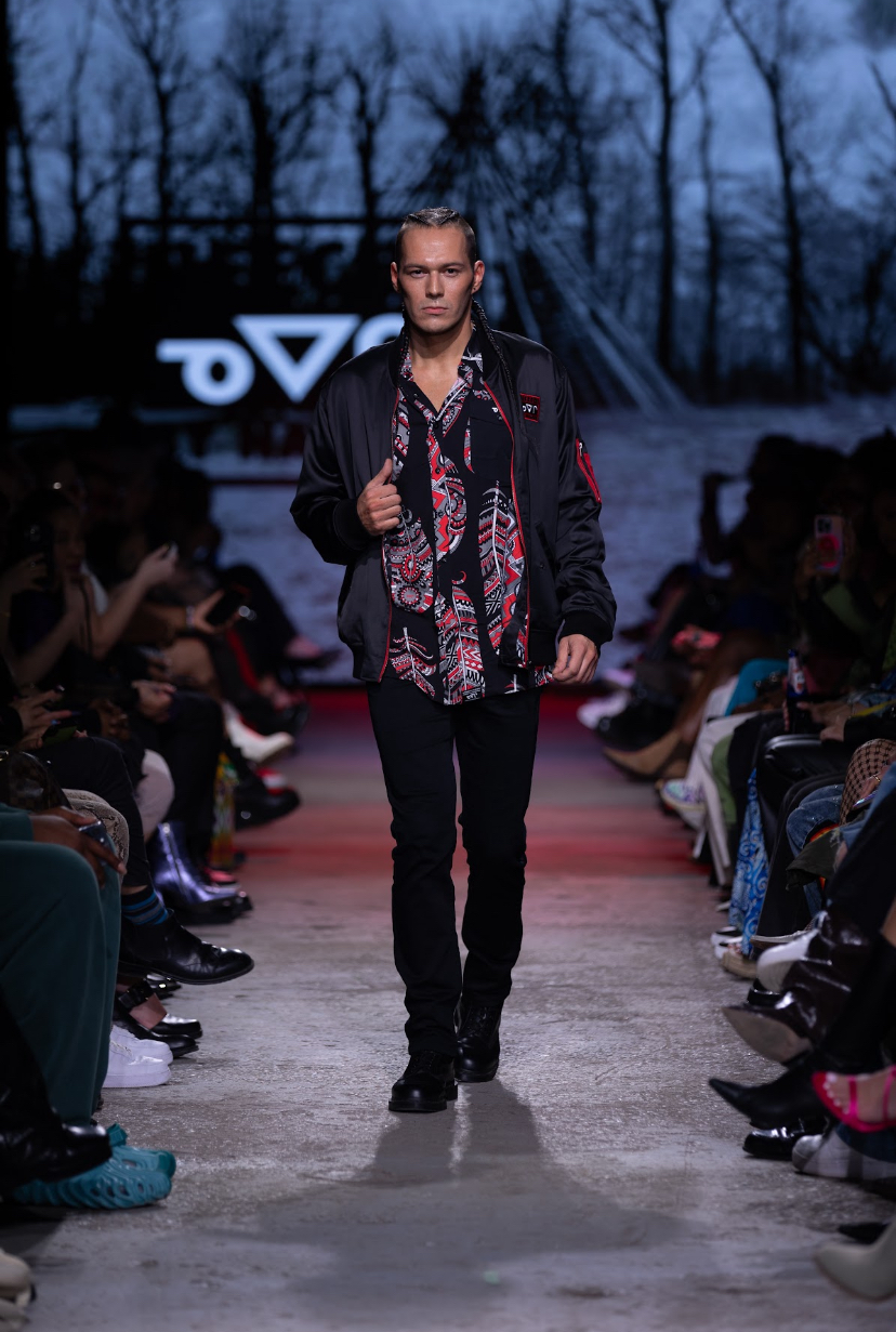
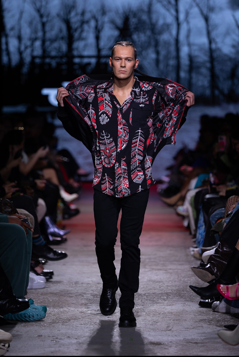
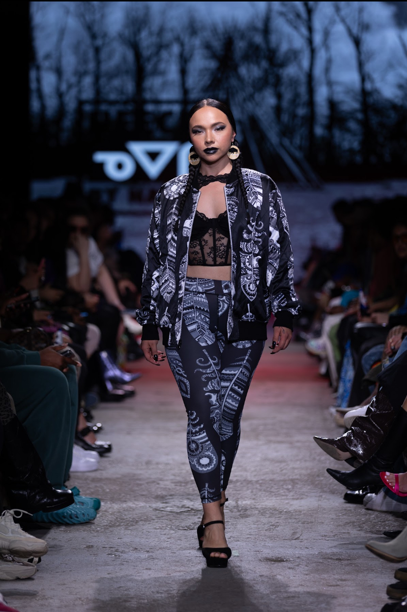
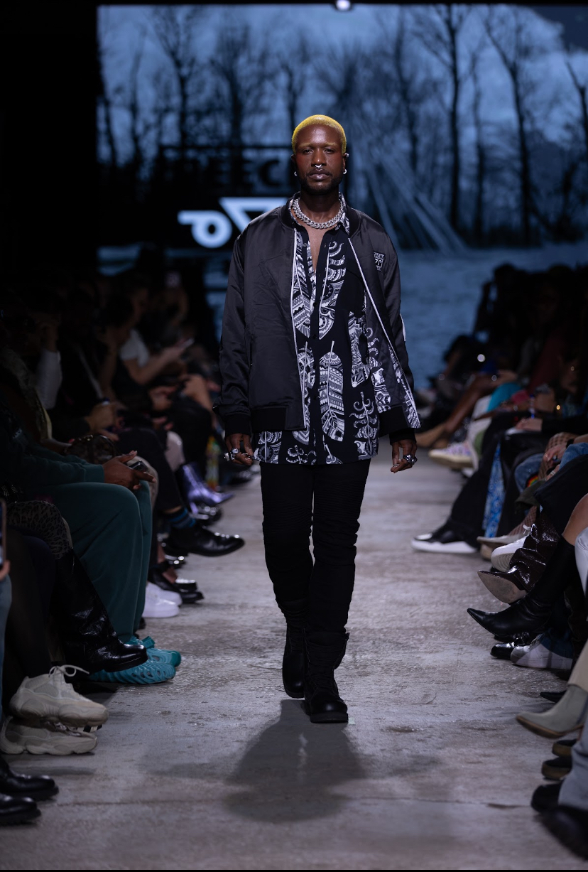
“From the Rez to the Streets”, the collection by multidisciplinary artist and designer Shane Kejick for his label Neechi by Nature, was the pure embodiment of the power that clothing can hold. Kejick, who comes from a background of Anishinaabe Ojibwe heritage, created a showcase that displayed both the hardship and beauty found within urban communities.
Lights were flashing as one of the performer’s from Kingbird’s collection returned once again in their colourful costume to introduce Neechi By Nature’s show with a traditional dance. Soon after, the first four looks were presented simultaneously on the runway. Models wore bulletproof vest, each representing one of the colours of the Four Directions of the Medicine Wheel - a sacred concept in Indigenous culture. Spray painted on the back of each vest was a graffiti-style ‘NEECHI’, and with matching ski masks the models acted out the process of forceful arrest.
The garments presented were reminiscent of streetwear - bomber jackets and leggings - masterfully infused with the grandness and beauty of Indigenous culture. There seemed to be an influence from Black culture aesthetics in the accessories, represented by iced-out chains, smatterings of rings, and even golden tooth caps. A graphic print of a feather (in either gold or black) was often seen throughout the collection, and this motif gorgeously complimented the colourful beaded feather earrings worn by models. The makeup was bold and glamorous, with hair mostly in braided traditional styles.
"From the Rez to the Streets", Neechi by Nature. Fashion Art Toronto's 1664 Fashion Week SS24.
Photography by Jack Hathaway.
The music ranged in tone - the somber “Gangster’s Pain” by Kitty being followed up with Lil’ Wayne’s “A Milli”, for example. Models took no hurry down the runway, eyeing the audience almost confrontationally, giving them time to take everything in - including their own culpability. During the ending walk, the models raised their hands in a fist - a mark of solidarity within activism - and were joined by many in the audience.
SEB
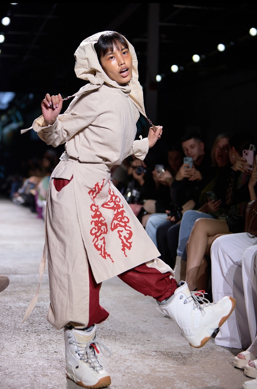
The audience was immediately caught off guard as a model stumbled in (literally) for SEB’s ‘EDIT’. At first he appears intoxicated, but soon breaks into a Joker-like grin - as if smiling at a joke that only he can hear. Loud, abrasive electronic music roared in the background, and audience members were concerned that they may be witnessing an asylum escape. Models angrily stomped down the runway in combat boots, tearing off their garments to drag behind them on the floor.
As a designer, Sebastian Baquero draws inspiration from his self described "punk/skater upbringing", as well as "innovation and [the] desire to push new ideas forward". EDIT is "a celebration of being comfortable in your own skin" and "embracing your journey, scars [...] making a bold statement without uttering a word. These pieces are not just garments; it's a rebellion against conformity".
Working with a black-and-white palette, Seb's designs were subversive. Consisting of mesh shirts, torn denim, and leather with chained collars. One model had their headshot messily taped onto their shirt, another’s tee bore the slogan “even machines need therapy.” One model had a bit of a demented schoolgirl look, like a demon-possessed Britney Spears. Baquero explains that the pieces were made from a method of "upcycling unwanted and forgotten clothing" by "adding new life through imperfections and emotion".
The models themselves looked dirty, with grungy kohl-rimmed eyes smeared down cheeks and over lips. In a playful juxtaposition, other models had clean linework on their faces, created with opaque black liner and a skilled hand. Hair was similarly messy and frayed, with copious amounts of hair gel and teasing used to create spikes and shapes. One model, holding printed photos of a skateboard (something that actually appears more than once) has a series of silver hardware attached to their locs, matching their chain-like neckpiece.
"EDIT", SEB. Fashion Art Toronto's 1664 Fashion Week SS24.
Photography by Jack Hathaway.
Their palpable rage wasn’t simply reserved for the ground; it was also extended to the audience, most notably when model Luz flicked the hat off of an audience member. Models who weren’t being confrontational simply looked bored - lazily eyeing the audience with deadpan expressions (model Amelia even casually chewing gum). This was, without a doubt, one of the most entertaining and dynamic shows of the season. SEB truly understands how to keep the viewer on the edge of their seat.
LIGNES DE FUITE
Canadian talent incubator Lignes De Fuite (translating in English to “Lines of Flight”) is helmed by Milan Tanedjikov, a fashion designer and teacher at Montreal’s Collège Lasalle. Their Fashion Art Toronto runway featured five talented designers who recently graduated from their mentorship program, with 5-piece mini-collections showcased consecutively during their slot (save for Process Visual's lengthier presentation).
CARRÉ BOURGOGNE
Carré Bourgogne’s debut collection ‘MOYOCOYOTZIN (She Who Creates Herself)’ immediately displayed the talent, craftsmanship, and care required to be a part of Lignes De Fuite. As leather is one of the most difficult fabrics to manipulate, its properties often make it feel more stiff and masculine, yet the designer was able to create beautiful, form fitting corsets and crinolines from such a rigid material.
Designer Joe Koubayati notes that the initial conceptual stage of MOYOCOYOTZIN involved significant self-reflection. "While challenging my habit of pursuing trauma as a means of acuiring wisdom and self-realization," says Koubayati, "I sought an archetype that truly resonated with me." He goes on to cite inspiration from the story of Turkish singer Bergen and Deleuzian philosophy as a basis for the collection.
"My fabric manipulation shows my intention of sculpting and pleating my own destiny, no matter de difficulty or the initial purpose of it," Koubayati says about his craft. The looks featured earth-tone garments that abstracted the body in a softer way, contrasting against the hard leather. The makeup was glamorous, with shades of brown to complement the garments. The models all had excessive amounts of hair gel, giving the hair a similar hardness to the leather.
"MOYOCOYOTZIN", Carré Bourgogne. Fashion Art Toronto's 1664 Fashion Week SS24.
Photography by Jack Hathaway.
The third and fifth looks seemed to complement each other as well - the top of the former being a giant blooming piece that appeared to evolve at the end to encompass the models’ entire body. The dedication to this collection was undeniable - for the audience, it was impossible not to take note.
SWEEVEN
Designer Maxence Richard of Sweeven wonderfully captured the whimsy and textures of nature with their collection of knitwear. Made from natural fibres and ethically sourced materials, the garments gently hugged the wearer’s bodies while remaining soft and comfortable. Richard "employs rudimentary historical techniques such as knitting, crochet, felting, weaving, and hand-sewing" to "create practical and beautiful garments reminiscent of historical functions and the beauty found in nature."
The immediate impression was that mermaids had washed up to shore, their tails having transformed into legs, and walked right out onto the runway - the webbing of the yarn could even be interpreted as a tangle of fishnets or a clump of kelp. Expounding this
interpretation was subtle oceanic elements, like a shell necklace or mother-of-pearl buttons. One white sweater was akin to fluffy cotton, patiently waiting to be harvested. The freehand knitting technique gave one the impression of watching the gentle rocking of ocean waves or the lazy sway of tall grass.
Sweeven, at Fashion Art Toronto's 1664 Fashion Week SS24.
Photography by Jack Hathaway.
Garments often extended beyond the models’ bodies, allowing the clothes to dance in the air. An air of softness was present within the models’ plaited hair and dewy makeup - a few braids featuring the same yarn as the garments expertly woven in. The model for the finale look perfectly encapsulated the aura of a haunted siren, floating down the runway to a soundtrack of dreamy orchestral reverie.
GIO CACI
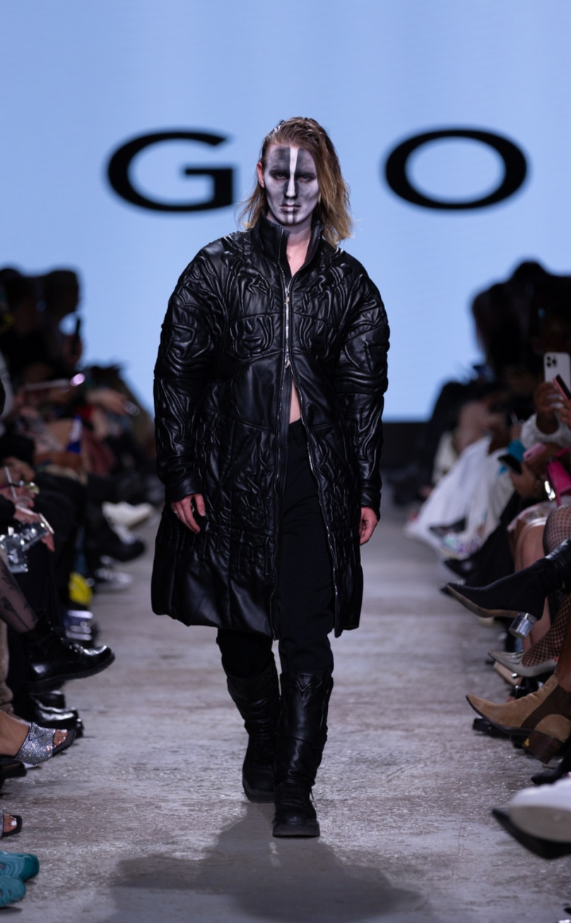
The following collection, ‘ANATHEMA’ by Gio Caci, was dark and edgy with an underlying sinister tinge. Caci’s designs revolve around two main concepts: body augmentation and trapunto, an Italian quilting method which gives the fabric more relief. The proportions and tailoring of the garments made the models seem bigger, stronger - with the harshness of leather as a medium heightening this effect. Caci describes his brand as "emphasizing traditional handcraft, body augmentation, and durability into its ethos as a means of empowering the feeble mind."
Right out of the gate we had frequent FAT model Brandon storming down the runway in full corpse paint, giving homage to Norwegian black metal band Mayhem’s signature look. The remainder of the makeup continued the “frightening in the best way” theme, mainly consisting of a white base with some sort of harsh black design. One of the models had ‘ANATHEMA’ written on their forehead and another seemed to be regurgitating black bile as they walked down with white eye contacts, as if they had just risen from the grave to model for Caci. The last look was straight out of The Crow, worn by model Theo with chunky boots and a long black coat.
"ANATHEMA", Gio Caci. Fashion Art Toronto's 1664 Fashion Week SS24.
Photography by Jack Hathaway.
One look in particular, however, stood out from the rest - a large veil of the same leather manipulated by trapunto. The model demurely hugged themselves, staring coyly into the camera. This was quite the shift from the previous looks, which were purely confident. Caci was able to beautifully capture the vulnerability that lives within strength.
WJ CROSSON
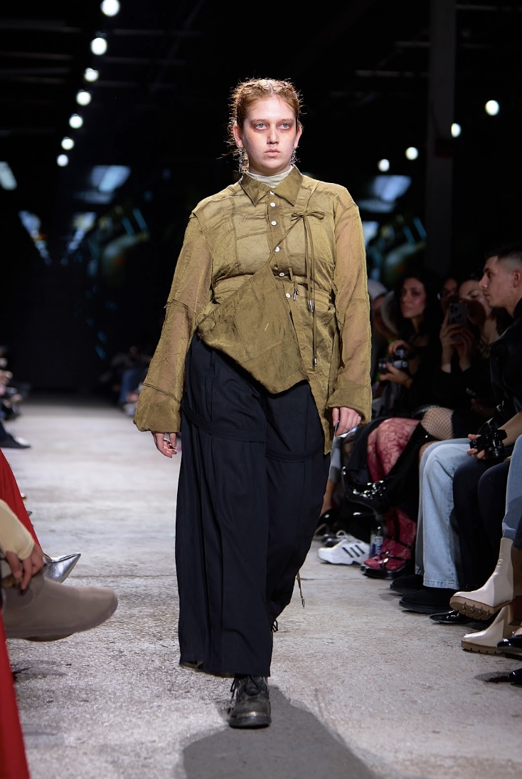
WJ Crosson proudly embraces the sublime nature of Canadian flora and fauna, as displayed in their collection "Carillion". Through delicate embroidery, Crosson represents imagery such as igloos and loons on trucker hats, jean jackets, plaids and denims - elements that are synonymous with quintessential Canadiana culture. The opening video effectively set the tone with footage of a moving train, a bright red car in a landscape swallowed by snow, and close-up shots of a match being lit and a small bird’s face.
"To be inspired by “Canadiana” is, in large part, to be inspired by the ordinary," Crosson admits in an artist statement. "Silhouettes common to workwear, the outdoors, and our everyday lives are reinterpreted and elevated through ardent craftsmanship and handiwork." Indeed, models had what appeared to be camping supplies (snowshoes, a canvas bag reading “heading for Nipissing”) slung over their shoulders with a thick rope, emphasizing the collection’s practical nature. The most stunning look from this collection was, in our opinion, a distressed denim set torn in such a way as to resemble Van Gogh’s depictions of water.
"Carillion", WJ Crosson. Fashion Art Toronto's 1664 Fashion Week SS24.
Photography by Jack Hathaway.
Beyond showcasing the beauty of nature in Canada, the collection doubled as a warning. A video played in the background that went back and forth between showing nature’s prime and the consequences of pollution such as the death of innocent animals and the erasure of the landscapes we oh-so treasure.
PROCESS VISUAL
Closing out the Lignes De Fuite presentation, Process Visual’s suspenseful show “BALLOON” was an avant-garde exploration of the human figure. The designs made use of unconventional materials, such as cling wrap and actual balloons, to extend the body in interesting ways. Designer Jessy Colucci describes the avant-garde collection in an appropriately ominous way - as "a call for expansion in constricted environments, a desire to explore atypical shape, a celebration of the past, a nostalgic moment to remember the future by". In our opinion, Colucci absolutely nailed this concept. The show was a joy to experience.
One model’s top was made from a sleeping bag, which extended from their neck to their waist, completely abstracting the top half of their body. Another carried a bag with silver tinsel spilling out - the same material being trailed by the garments as well. With the theme, we have to wonder - is this meant to be a play on balloon ribbons, or simply aesthetic? Regardless, this detail added an eye-catching metallic element to the collection, standing out against the primary rubber-like textile.
"BALLOON", Process Visual. Fashion Art Toronto's 1664 Fashion Week SS24.
Photography by Jack Hathaway.
Models wore black socks and sneakers, in a monotone scale of black, grey and white. Some of them had fascinator-type headwear of full balloons attached to their heads, translating into a strange alien-like silhouette. The clown-like lip makeup (subtle upturned corners in a pseudo-smile) was perhaps mocking the importance that we place on our physical forms, as we neglect to care for the soul.
DEATHWORKS
“This is not a fashion show. This is a show. This is not a work of fiction. Any similarity to actual persons living or dead or actual events is intentional. Pick your vice, think twice. Married to your own demise.”
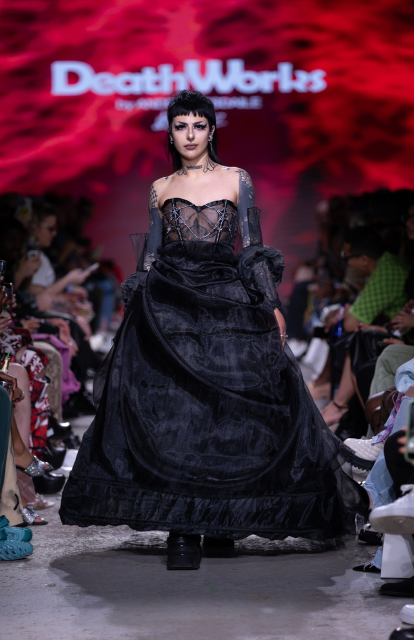
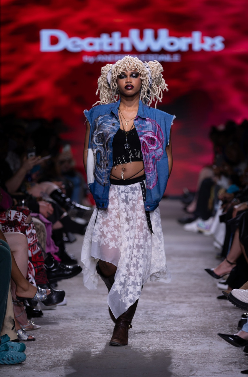
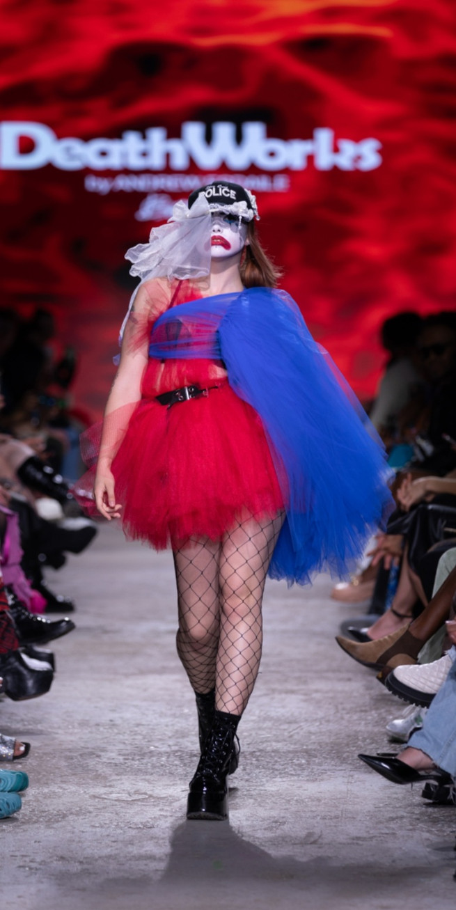
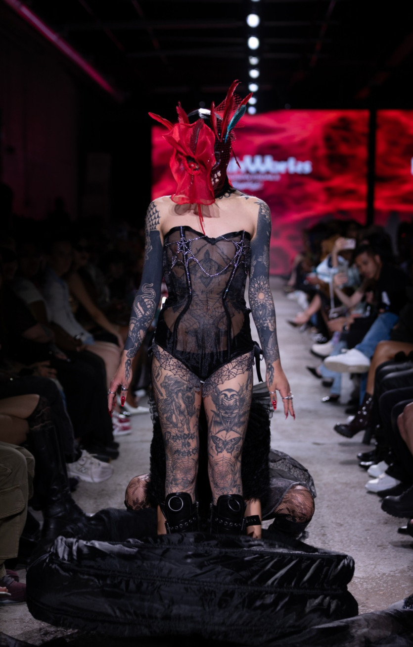
These were the words that flashed on the screen at the very start of DEATHWORKS’ new collection ‘Our Demise (Welcome to the End of the World)’. The lights flooded the room in red, and a masked performer emerged from the crowd to heavy guitar as the Smashing Pumpkins’ ‘Where Boys Fear to Tread’ reverberated throughout the space. The sinister figure stalked around for a bit, intimidating the audience, until they retreated to the shadows where they would lurk for the remainder of the show. Admittedly, it was weird - but an enrapturing weird that had us hooked.
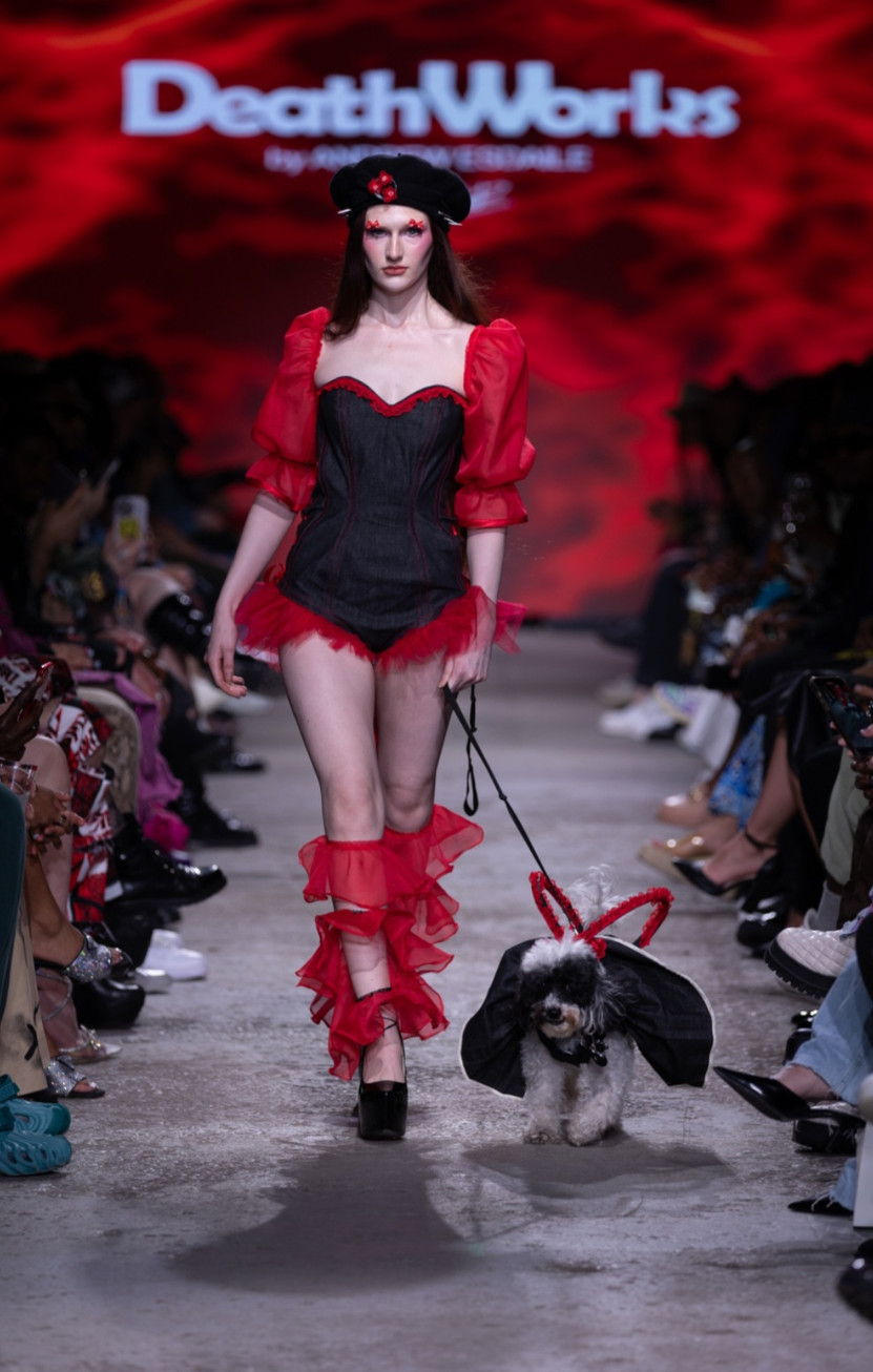
Designer Andrew Esdaile clearly took inspiration from a myriad of alternative subcultures such as punk, scene, goth, and grunge. Floral stockings, thigh-high boots, distressed fabrics, and patchwork laid the foundation for the collection. Most garments seemed to depict a battle between light and dark; a dichotomy of pure and sinful, masculine and feminine. Every look was intended to represent a different concept (each with names like “harlequin”, “C.E.O”, or our favorite “Cunt-E.O”), so the outfits, hair and makeup were unique to their character. The music was unconventional for a standard “runway” show, which itself was a breath of fresh air - grungy hits from Nirvana and Radiohead’s ‘Creep’ were interspersed with hard pop-trap beats from Rico Nasty and Cobrah.
"Our Demise (Welcome to the End of the World)", Deathworks.
. Fashion Art Toronto's 1664 Fashion Week SS24. Photography by Jack Hathaway.
The hair styling for the show was incredibly creative - safety pins, spikes, plushies, and copious amounts of hair gel were used to match the eclectic nature of the clothes. Naturally, makeup was bold and unconventional to match, and while a good portion of the looks featured masks obscuring faces, we saw 90’s grunge eyeshadows and clown-inspired drag (with a few looks featuring mini-bows centered above the eyes). To expound on the theme, the runway walks were extremely theatrical - One model smoked a cigarette as they walked down the runway, and model Juliet had her service dog Luna by her side in a matching outfit. No detail was overlooked - and in this case, the devil was certainly present in them.
About halfway through the show, we suddenly noticed another creature at the end of the runway - this one appeared to be a harbinger of death, ushering models off the runway and through the gates of hell. At the end, the harbinger and the demon clown storm down the runway, holding a small mirror up to the audience - the joke's on us, we're to blame for our own demise. It may be uncomfortable to be faced with the existential reality of humanity's negligence, but as Esdaile argues through "Our Demise", a harsh wake-up call is way past due.
--
Day 3 of Fashion Art Toronto successfully carried the energy and excitement of opening night into the weekend, setting us up for an absolutely banger closing day. Guests left feeling a palpable buzz of satisfaction from the day’s events, with an underlying air of anticipation for what was to come on closing night, mere hours away.
Stay tuned…






































































































Such an inspiring mix of voices and visions at FAT Day 3. For more indie fashion and cultural perspectives, Archaic Press Magazine is a great read alongside this recap.
"Hey, if you're looking for a reliable Cryptocurrency Recovery company, I highly recommend Lost Recovery Masters. I've had a great experience with them, they're trustworthy and deliver on their promises.
contact them on
Website: (lostrecoverymasters. com/)
What s app +44(7537-105921
Support Email (Support @ lostrecoverymasters com)
Support @ lostrecoverymasters. com